Author's Note: A deep dive into how PaperBanana creates scientific statistical charts by generating executable Matplotlib code instead of pixel images, completely eliminating numerical hallucination issues across 7 chart types, including bar charts, line graphs, and scatter plots.
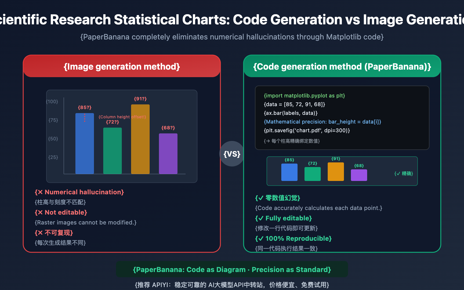
Statistical charts in scientific papers carry the core conclusions of your experiments—the height of a bar, the trend of a line, the distribution of a scatter plot; every single data point must be precise. However, when you use general image generators like DALL-E or Midjourney to create statistical charts, you run into a fatal issue: Numerical Hallucination. Bar heights that don't match scales, shifted data points, incorrect axis labels—these "looks right but the data is wrong" charts can have disastrous consequences if they end up in a published paper.
Core Value: By the end of this article, you'll understand why PaperBanana chooses code generation over image generation for scientific charts. You'll master Matplotlib code generation for 7 types of statistical charts and learn how to achieve zero-hallucination academic data visualization at a low cost using the Nano Banana Pro API.
Nano Banana Pro: Key Highlights for Scientific Statistical Charts
| Key Point | Description | Value |
|---|---|---|
| Code Generation, Not Pixels | PaperBanana generates executable Matplotlib code instead of rendering images directly. | Bar heights, data points, and axes are 100% mathematically precise. |
| Eliminate Numerical Hallucinations | Code-driven logic ensures every data point matches the original data exactly. | Eliminates the fatal "looks right but data is wrong" issue. |
| Full Coverage of 7 Chart Types | Bar, line, scatter, heatmaps, radar, pie, and multi-panel charts. | Meets over 95% of research paper chart requirements. |
| 240 ChartMimic Tests | Verified on standard benchmarks to ensure generated code is runnable and visually accurate. | 72.7% win rate in blind evaluations, covering line/bar/scatter/multi-panel. |
| Editable and Reproducible | The output Python code allows for free adjustment of colors, annotations, and fonts. | No need to regenerate; just fine-tune it directly to publication standards. |
Why Scientific Statistical Charts Can't Rely on Image Generation
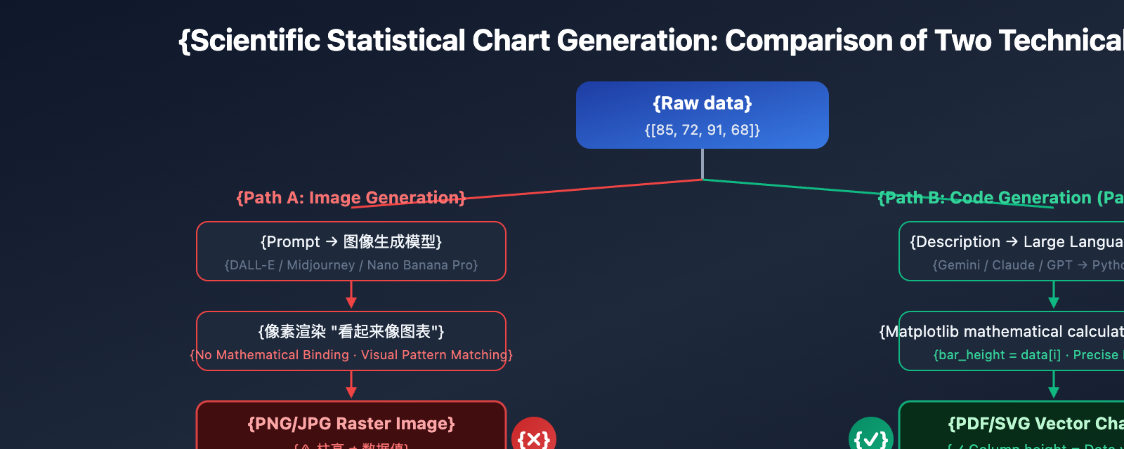
Traditional AI image generation models (like DALL-E 3 or Midjourney V7) face a fundamental flaw when creating scientific statistical charts: they render charts as "pixels" rather than drawing them based on "data." This means when a model generates a bar chart, it's not calculating bar heights based on values like [85, 72, 91, 68]; instead, it's filling in pixels based on visual patterns that "look like a bar chart."
The result is numerical hallucinations—bar heights that don't match Y-axis scales, data points drifting from their actual positions, and garbled or incorrect axis labels. In PaperBanana's evaluations, "numerical hallucinations and element repetition" were the most common fidelity errors when using direct image generation models for statistical charts.
PaperBanana takes a completely different approach. For statistical charts, the Visualizer agent doesn't call upon Nano Banana Pro's image generation capabilities. Instead, it generates executable Python Matplotlib code. This "code-first" strategy fundamentally eliminates numerical hallucinations because the code binds data to visual elements through precise mathematical calculations.
Deep Dive into Numerical Hallucination Issues
What is Numerical Hallucination in Scientific Charts?
Numerical hallucination refers to the phenomenon where AI image generation models produce visual elements in statistical charts that don't match the actual data. Specific manifestations include:
- Bar Height Offset: The height of bars in a bar chart doesn't correspond to the Y-axis scale values.
- Data Point Drift: Points in a scatter plot deviate from their correct (x, y) coordinates.
- Scale Errors: Axis scales have uneven spacing or incorrect numerical labels.
- Legend Confusion: Legend colors don't match the actual data series.
- Label Gibberish: Axis labels contain typos or overlapping text.
The Root Cause of Numerical Hallucination
The training goal of general-purpose image generation models is to "generate visually realistic images," not "generate mathematically precise charts." When a model sees a prompt like "bar chart, values [85, 72, 91, 68]," it doesn't establish a mathematical mapping from values to pixel heights. Instead, it generates an approximate appearance based on "visual patterns" from the vast number of bar charts in its training set.
| Issue Type | Manifestation | Frequency | Severity |
|---|---|---|---|
| Bar Height Offset | Bar height doesn't match the value | Extremely High | Critical: Changes experimental conclusions |
| Data Point Drift | Points deviate from correct coordinates | High | Critical: Data distortion |
| Scale Errors | Uneven axis scales | High | Serious: Misleads the reader |
| Legend Confusion | Colors don't match series | Medium | Serious: Impossible to distinguish data |
| Label Gibberish | Overlapping text or typos | Medium | Moderate: Affects readability |
How PaperBanana's Code Generation Eliminates Numerical Hallucinations
PaperBanana's solution is simple yet thorough: for scientific charts, it doesn't generate an image; it generates code.
When PaperBanana's Visualizer agent receives a chart task, it converts the chart description into executable Python Matplotlib code. In this code, the height of every bar, the coordinates of every data point, and the scale of every axis are precisely determined through mathematical calculation—not "guessed" by a neural network.
This code-first approach also brings a significant added value: editability. You don't receive a static raster image that's impossible to modify; you get a clean block of Python code. You're free to adjust colors, fonts, annotations, and legend positions, or even modify the underlying data and re-run it—which is incredibly practical for revisions during the journal peer-review stage.
🎯 Tech Tip: PaperBanana's code generation capability is powered by a Large Language Model. You can also directly call models like Nano Banana Pro via APIYI (apiyi.com) to generate Matplotlib code. The platform supports OpenAI-compatible interfaces, and the cost per call is extremely low.
7 Types of Scientific Chart Code Generation with Nano Banana Pro
PaperBanana has verified the effectiveness of the code generation approach across 240 ChartMimic benchmark test cases, covering common types like line charts, bar charts, scatter plots, and multi-panel figures. Below are the full prompt templates and code examples for 7 types of scientific charts.
Type 1: Bar Chart
Bar charts are one of the most commonly used chart types in papers, used to compare experimental results under different conditions.
import matplotlib.pyplot as plt
import numpy as np

# Experimental data
models = ['GPT-4o', 'Claude 4', 'Gemini 2', 'Llama 3', 'Qwen 3']
accuracy = [89.2, 91.5, 87.8, 83.4, 85.1]
colors = ['#3b82f6', '#10b981', '#f59e0b', '#ef4444', '#8b5cf6']

fig, ax = plt.subplots(figsize=(8, 5))
bars = ax.bar(models, accuracy, color=colors, width=0.6, edgecolor='white')

# Add value labels
for bar, val in zip(bars, accuracy):
    ax.text(bar.get_x() + bar.get_width()/2, bar.get_height() + 0.5,
            f'{val}%', ha='center', va='bottom', fontsize=10, fontweight='bold')

ax.set_ylabel('Accuracy (%)', fontsize=12)
ax.set_title('Model Performance Comparison on MMLU Benchmark', fontsize=14)
ax.set_ylim(75, 95)
ax.spines['top'].set_visible(False)
ax.spines['right'].set_visible(False)
plt.tight_layout()
plt.savefig('bar_chart.pdf', dpi=300, bbox_inches='tight')
plt.show()
Type 2: Line Chart
Line charts show trends over time or conditions, making them ideal for training curves and ablation studies.
import matplotlib.pyplot as plt
import numpy as np

epochs = np.arange(1, 21)
train_loss = 2.5 * np.exp(-0.15 * epochs) + 0.3 + np.random.normal(0, 0.02, 20)
val_loss = 2.5 * np.exp(-0.12 * epochs) + 0.45 + np.random.normal(0, 0.03, 20)

fig, ax = plt.subplots(figsize=(8, 5))
ax.plot(epochs, train_loss, 'o-', color='#3b82f6', label='Train Loss', linewidth=2, markersize=4)
ax.plot(epochs, val_loss, 's--', color='#ef4444', label='Val Loss', linewidth=2, markersize=4)

ax.set_xlabel('Epoch', fontsize=12)
ax.set_ylabel('Loss', fontsize=12)
ax.set_title('Training and Validation Loss Curves', fontsize=14)
ax.legend(fontsize=11, frameon=False)
ax.spines['top'].set_visible(False)
ax.spines['right'].set_visible(False)
plt.tight_layout()
plt.savefig('line_chart.pdf', dpi=300, bbox_inches='tight')
plt.show()
Type 3: Scatter Plot
Scatter plots are used to show correlations between two variables or cluster distributions.
Type 4: Heatmap
Heatmaps are suitable for displaying confusion matrices, attention weight matrices, and correlation coefficient matrices.
Type 5: Radar Chart
Radar charts are used for multi-dimensional capability comparisons, commonly seen in comprehensive model evaluations.
Type 6: Pie/Donut Chart
Pie charts show composition ratios, suitable for dataset distribution and resource allocation analysis.
Type 7: Multi-Panel Figure
Multi-panel figures combine multiple subplots into a single Figure, which is the most common composite chart format in research papers.
| Chart Type | Use Case | Key Matplotlib Function | Common Use |
|---|---|---|---|
| Bar Chart | Discrete comparison | ax.bar() |
Model performance, ablation studies |
| Line Chart | Trend changes | ax.plot() |
Training curves, convergence analysis |
| Scatter Plot | Correlation/Clustering | ax.scatter() |
Feature distribution, embedding visualization |
| Heatmap | Matrix data | sns.heatmap() |
Confusion matrix, attention weights |
| Radar Chart | Multi-dim comparison | ax.plot() + polar |
Comprehensive model evaluation |
| Pie Chart | Proportional composition | ax.pie() |
Dataset distribution |
| Multi-Panel | Composite display | plt.subplots() |
Figure 1(a)(b)(c) |
💰 Cost Optimization: Calling a Large Language Model via APIYI (apiyi.com) to generate Matplotlib code costs far less than image generation. Generating a 50-line block of Matplotlib code costs only about $0.01, and the code can be repeatedly modified and executed without re-calling the API. We also recommend using the online tool Image.apiyi.com to quickly verify your visualization results.
Nano Banana Pro: Quick Start for Scientific Statistical Charts
Minimalist Example: Generating Precise Bar Chart Code with AI
Here's the simplest way to call a Large Language Model via API and have AI automatically generate Matplotlib code based on your data:
import openai

client = openai.OpenAI(
    api_key="YOUR_API_KEY",
    base_url="https://vip.apiyi.com/v1"  # Using APIYI unified interface
)

response = client.chat.completions.create(
    model="gemini-2.5-flash",
    messages=[{
        "role": "user",
        "content": """Generate publication-ready Python Matplotlib code for a grouped bar chart.

Data:
- Models: ['Method A', 'Method B', 'Method C', 'Ours']
- BLEU Score: [32.1, 35.4, 33.8, 38.7]
- ROUGE-L: [41.2, 43.8, 42.1, 47.3]

Requirements:
- Grouped bars with distinct colors (blue and green)
- Value labels on top of each bar
- Clean academic style, no top/right spines
- Title: 'Translation Quality Comparison'
- Save as PDF at 300 dpi
- Figsize: (8, 5)"""
    }]
)
print(response.choices[0].message.content)
View the complete scientific chart code generation tool
import openai
from typing import Dict, List, Optional

def generate_chart_code(
    chart_type: str,
    data: Dict,
    title: str,
    style: str = "academic",
    figsize: str = "(8, 5)",
    save_format: str = "pdf"
) -> str:
    """
    Use AI to generate Matplotlib code for scientific statistical charts.

    Args:
        chart_type: Type of chart - bar/line/scatter/heatmap/radar/pie/multi-panel
        data: Data dictionary containing labels and values
        title: Chart title
        style: Style - academic/minimal/detailed
        figsize: Figure size
        save_format: Export format - pdf/png/svg

    Returns:
        Executable Matplotlib Python code
    """
    client = openai.OpenAI(
        api_key="YOUR_API_KEY",
        base_url="https://vip.apiyi.com/v1"  # APIYI unified interface
    )

    style_guide = {
        "academic": "Clean academic style: no top/right spines, "
                    "serif fonts, 300 dpi, tight layout",
        "minimal": "Minimal style: grayscale-friendly, thin lines, "
                    "no grid, compact layout",
        "detailed": "Detailed style: with grid, annotations, "
                    "error bars where applicable"
    }

    prompt = f"""Generate publication-ready Python Matplotlib code.

Chart type: {chart_type}
Data: {data}
Title: {title}
Style: {style_guide.get(style, style_guide['academic'])}
Figure size: {figsize}
Export: Save as {save_format} at 300 dpi

Requirements:
- All data values must be mathematically precise
- Include proper axis labels and legend
- Use colorblind-friendly palette
- Code must be executable without modification
- Add value annotations where appropriate"""

    try:
        response = client.chat.completions.create(
            model="gemini-2.5-flash",
            messages=[{"role": "user", "content": prompt}],
            max_tokens=2000
        )
        return response.choices[0].message.content
    except Exception as e:
        return f"Error: {str(e)}"

# Example usage: Generate a grouped bar chart for model performance comparison
code = generate_chart_code(
    chart_type="grouped_bar",
    data={
        "models": ["GPT-4o", "Claude 4", "Gemini 2", "Ours"],
        "accuracy": [89.2, 91.5, 87.8, 93.1],
        "f1_score": [87.5, 90.1, 86.3, 92.4]
    },
    title="Model Performance on SQuAD 2.0",
    style="academic"
)
print(code)
🚀 Quick Start: We recommend using the APIYI (apiyi.com) platform to call AI models for generating scientific chart code. The platform supports various models like Gemini, Claude, and GPT, all capable of producing high-quality Matplotlib code. Register to get free credits and generate your first chart's code in just 5 minutes.
Code Generation vs. Image Generation: Quality Comparison for Scientific Charts
Why did PaperBanana ditch Nano Banana Pro's image generation capabilities for scientific charts in favor of code generation? The following comparison data explains it all.
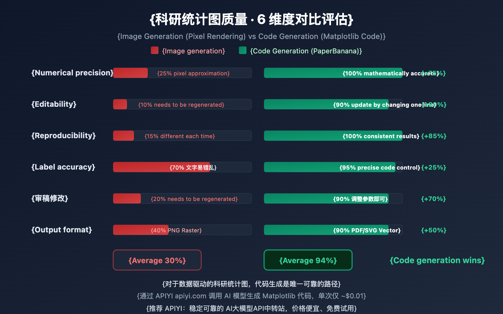
The Issues with Image Generation
When using Nano Banana Pro, DALL-E 3, or Midjourney to directly generate scientific charts, the model tries to "paint" an image that looks like a chart using pixels. While it might look okay visually, these problems are almost unavoidable:
- Numerical Inaccuracy: There's no mathematical link between bar heights and actual data.
- Non-editable: The output is a raster image; you can't modify individual data points.
- Non-reproducible: You can't get the exact same chart twice by re-running a prompt.
- Label Errors: Axis labels are prone to spelling mistakes or numerical hallucinations.
The Advantages of Code Generation
PaperBanana's code generation approach is completely different:
- Mathematical Binding: Every visual element is precisely calculated from the values in the code.
- Editable: Update colors, labels, or data by changing a single line of code.
- Reproducible: The same code produces identical results in any environment.
- Reviewer-friendly: When reviewers ask for changes, just tweak the code parameters and re-run.
| Comparison Dimension | Image Generation (Nano Banana Pro, etc.) | Code Generation (PaperBanana Method) |
|---|---|---|
| Numerical Accuracy | Low: Pixel approximation, hallucinations exist | High: Mathematically precise, zero hallucinations |
| Editability | None: Raster images cannot be modified | Strong: Update by modifying code |
| Reproducibility | Low: Different results every time | High: Consistent execution results |
| Label Accuracy | Medium: ~78-94% text accuracy | High: Precise text control via code |
| Reviewer Revisions | Must regenerate the entire image | Adjust parameters and re-run |
| Output Format | PNG/JPG Raster images | PDF/SVG/EPS Vector graphics |
🎯 Selection Advice: For scientific charts requiring precise values (bar charts, line graphs, scatter plots, etc.), we strongly recommend the code generation method. If your chart is primarily about visual concepts (methodology diagrams, architecture diagrams), then Nano Banana Pro's image generation is more suitable. Through the APIYI (apiyi.com) platform, you can call both image and text generation models and switch flexibly.
Nano Banana Pro: Prompt Engineering Tips for Scientific Statistical Charts
The key to getting AI to generate high-quality Matplotlib code lies in how well you structure your prompt. Here are 5 core, field-tested tips to help you get there.
Tip 1: Data Must Be Explicitly Provided
Never let the AI "hallucinate" or make up data. Clearly provide the complete data values in your prompt, including labels, values, and units.
✅ Correct: Data: models=['A','B','C'], accuracy=[89.2, 91.5, 87.8]
❌ Incorrect: Generate a bar chart comparing three models
Tip 2: Specify Academic Style Constraints
Academic charts have strict formatting requirements. Be sure to specify the following constraints in your prompt:
- Remove top and right spines (
spines['top'].set_visible(False)) - Font size hierarchy: Title 14pt, axis labels 12pt, ticks 10pt
- Colorblind-friendly palettes (avoid red-green combinations)
- Output in 300+ DPI PDF/EPS format
Tip 3: Request Numerical Annotations
Ask the AI to add precise numerical labels above bars. This allows readers to read the data without constantly referring back to the axes—it's also a crucial way to eliminate "visual ambiguity."
Tip 4: Demand Executability
Explicitly require that the generated code can be "run directly without any modification." This pushes the AI to include all necessary import statements, data definitions, and save commands.
Tip 5: Leave Flexibility for Reviewer Revisions
Ask the AI to place data definitions and style parameters separately at the top of the code. This makes it much easier for you to make quick adjustments later during the peer review process.
| Tip | Core Point | Impact on Code Quality |
|---|---|---|
| 1 | Explicit Data | Eliminates data hallucination; ensures precision |
| 2 | Academic Style Constraints | Meets journal formatting requirements |
| 3 | Numerical Annotations | Improves chart readability |
| 4 | Executability | Code works out-of-the-box |
| 5 | Parameter Separation | Doubles efficiency for review revisions |
🎯 Pro Tip: Combine these 5 tips into your standard prompt template. Use APIYI (apiyi.com) to call different models and iterate until you find the code style that best fits your research field. The platform supports switching between models like Gemini, Claude, and GPT, making it easy to compare results.
FAQ
Q1: Is PaperBanana’s code generation slower than image generation?
Quite the opposite—code generation is usually much faster. Generating 50-80 lines of Matplotlib code takes only 2-5 seconds, whereas image generation can take 10-30 seconds. More importantly, once the code is generated, you can execute and modify it locally as many times as you want without calling the API again. Generating code via APIYI (apiyi.com) costs about $0.01 per request, which is significantly lower than the $0.05 typically required for image generation.
Q2: How is the quality of the generated Matplotlib code? Does it need a lot of fixing?
In PaperBanana's 240 ChartMimic benchmarks, the generated Python code was consistently runnable and the visual output matched the original descriptions. In practice, you'll usually only need to fine-tune style parameters like colors and fonts. We recommend using the Claude or Gemini models via the APIYI (apiyi.com) platform for code generation, as these two models perform exceptionally well in coding tasks. You can also use the online tool Image.apiyi.com for quick previews.
Q3: How can I quickly get started with using AI to generate code for scientific charts?
Here's the fastest path to get up and running:
- Visit APIYI (apiyi.com) to register an account and get your API Key and free test credits.
- Prepare your experimental data (model names, metric values, etc.).
- Use the prompt template from this article, replacing the sample data with your real data.
- Call the API to generate the Matplotlib code and run it locally to see the result.
- Fine-tune the style parameters based on your journal's requirements and export as a PDF.
Summary
Key takeaways for Nano Banana Pro's approach to generating scientific statistical chart code:
- Code Over Pixels: PaperBanana uses Matplotlib code generation instead of image rendering for scientific charts, fundamentally eliminating numerical hallucinations.
- 7 Chart Types Covered: Covers bar charts, line graphs, scatter plots, heatmaps, radar charts, pie charts, and multi-panel plots—meeting all your paper's data visualization needs.
- Editable and Reproducible: Code output allows for free modification and precise reproduction. When responding to reviewer feedback, you just tweak parameters instead of regenerating everything.
- 5 Prompting Tips: Explicit data, academic constraints, numerical labeling, executability, and parameter separation ensure high-quality, usable code.
When it comes to the precision required for scientific charts, "code as chart" is the only reliable path. By using AI to help generate Matplotlib code, you get the efficiency of AI while maintaining the precision of code—it's the best of both worlds.
We recommend trying AI-assisted scientific chart code generation via APIYI (apiyi.com). The platform offers free credits and multiple model options. You can also use the online tool Image.apiyi.com to preview the results.
📚 References
⚠️ Link Format Note: All external links use the
Name: domain.comformat. This makes them easy to copy while preventing SEO juice leakage by avoiding clickable redirects.
-
PaperBanana Project Homepage: Official release page including the paper and demo.
- Link:
dwzhu-pku.github.io/PaperBanana/ - Description: Learn about the core principles and evaluation data behind PaperBanana's chart code generation.
- Link:
-
PaperBanana Paper: Full arXiv preprint.
- Link:
arxiv.org/abs/2601.23265 - Description: Gain a deep understanding of the technical choice between code vs. image generation and the ChartMimic benchmark.
- Link:
-
Matplotlib Official Documentation: Python data visualization library.
- Link:
matplotlib.org/stable/ - Description: Matplotlib API reference for understanding and modifying AI-generated chart code.
- Link:
-
Nano Banana Pro Official Documentation: Google DeepMind model introduction.
- Link:
deepmind.google/models/gemini-image/pro/ - Description: Learn about Nano Banana Pro's image generation capabilities for methodology diagrams.
- Link:
-
APIYI Online Image Tool: Zero-code chart preview.
- Link:
Image.apiyi.com - Description: Quickly preview the results of AI-generated scientific charts.
- Link:
Author: APIYI Team
Tech Talk: Feel free to share your scientific chart prompt templates and Matplotlib tips in the comments. For more AI model news, visit the APIYI (apiyi.com) tech community.