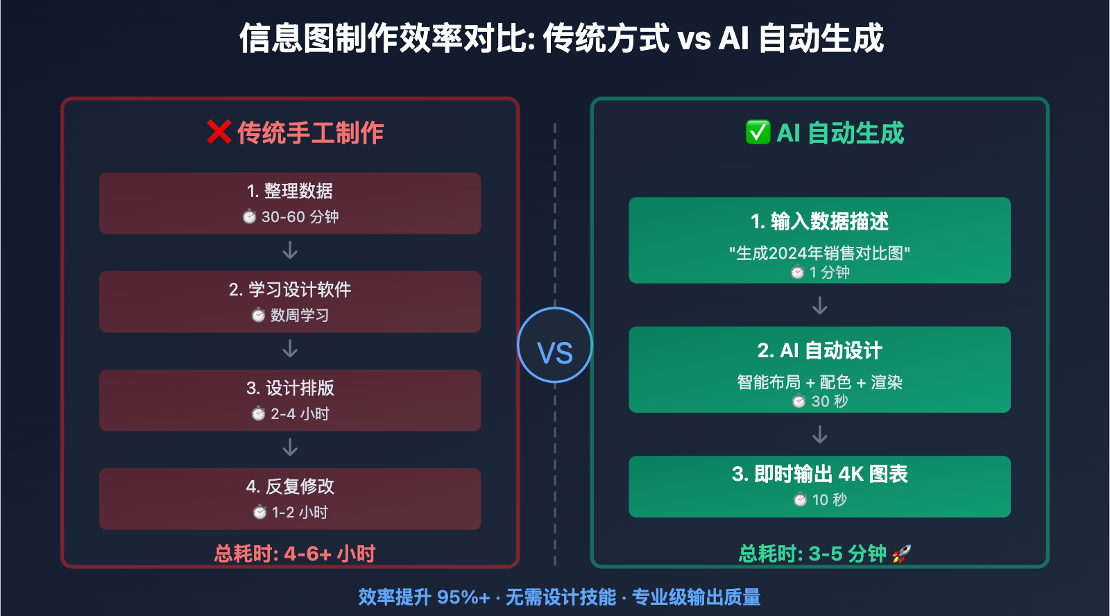
在内容创作和商业展示中,设计师经常面临"数据信息需要快速可视化,但传统设计工具效率低、技术门槛高"的困扰。这个问题的根源在于信息图制作需要专业的设计软件和排版技能,从数据整理到最终成图往往需要数小时甚至数天。本文将深入分析 Nano Banana Pro 数据可视化技术的实现原理,并提供经过验证的 3 步法快速制作专业信息图表。
Nano Banana Pro 数据可视化技术原理
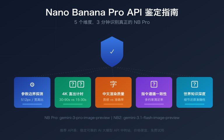
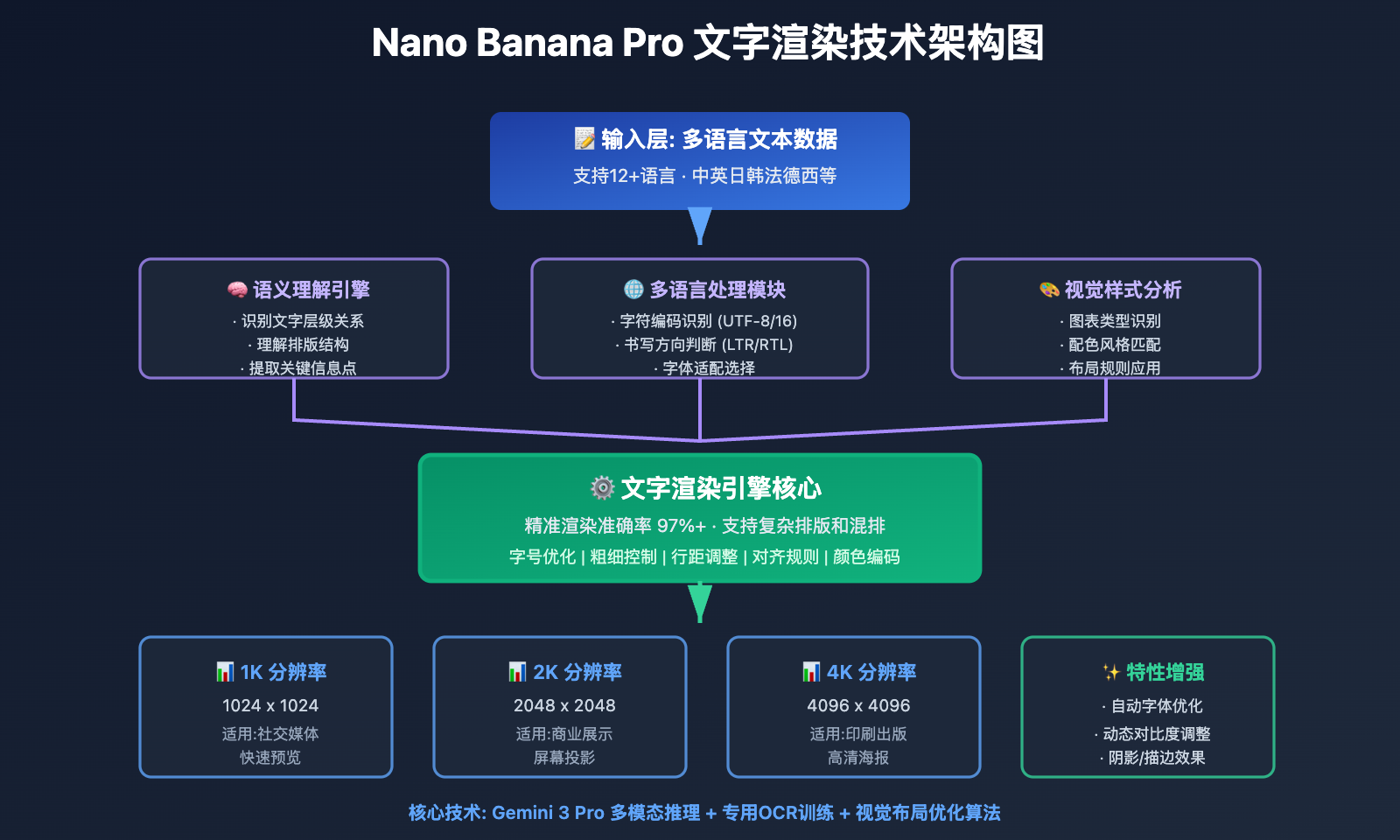
Nano Banana Pro (Gemini 3 Pro Image) 在2025年11月发布时,引入了业界领先的文字渲染和信息图表生成技术。这项技术能够实现 97%+ 的多语言文字准确率,并支持从简单的标签到完整段落的精确渲染,彻底解决了传统AI模型在信息图生成中的"文字乱码"和"排版混乱"问题。
突破性的文字渲染能力
Nano Banana Pro 是目前唯一能在图像中精准渲染复杂文字的AI模型,核心技术突破包括:
多语言文字识别与布局: 支持12+语言(中文、英文、日文、韩文、法文、德文、西班牙文等),每种语言的文字渲染准确率超过97%,能够正确处理从右到左(如阿拉伯语)和从左到右的书写系统
语义理解与排版优化: 模型不仅识别文字内容,还理解文字在信息图中的层级关系,自动优化标题、副标题、正文、标注的字号、粗细和位置
动态字体适配: 根据信息图的风格(专业商务、活泼卡通、学术严谨等)自动选择合适的字体风格和视觉效果
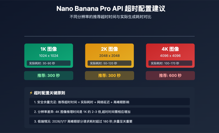
高分辨率输出: 支持1K/2K/4K三档分辨率,确保文字在任何尺寸下都清晰可读,满足印刷级需求
🎯 技术建议: 在实际信息图制作项目中,我们建议通过 API易 apiyi.com 平台进行 Nano Banana Pro 数据可视化功能的测试。该平台提供完整的文字渲染API接口,支持多语言文本输入和分辨率配置,有助于快速验证信息图表的生成效果。
智能数据理解与可视化映射
Nano Banana Pro 使用 Gemini 3 Pro 的推理能力进行数据理解和可视化设计:
数据类型识别: 自动识别数值型数据(温度、价格、百分比)、分类数据(产品类型、地区划分)、时间序列数据(趋势变化、历史对比),并选择最合适的可视化图表类型
视觉映射规则:
- 对比关系 → 柱状图/条形图
- 占比关系 → 饼图/环形图
- 趋势变化 → 折线图/面积图
- 地理分布 → 地图可视化
- 流程关系 → 流程图/时间轴
颜色语义编码: 自动应用颜色心理学原理,红色表示警告/下降,绿色表示成功/增长,蓝色表示专业/信任,橙色表示警示/活力
布局优化算法: 基于格式塔原理自动优化元素布局,确保视觉焦点清晰、信息层次分明、阅读路径流畅
💡 选择建议: 对于需要大量生成数据报告和营销素材的场景,我们建议优先使用 Nano Banana Pro 的数据可视化功能。通过 API易 apiyi.com 平台调用时,可以直接输入结构化数据,该平台支持 JSON/CSV 格式数据自动转换为提示词,便于批量生成标准化图表。
Nano Banana Pro 数据可视化 3 步法
第 1 步: 数据准备与结构化
核心原则: 将原始数据整理为清晰的结构化格式,明确数据维度和关键指标。
数据整理清单:
- 明确核心指标: 确定要展示的关键数字和趋势
- 分类维度: 定义数据的分组方式(时间、地域、类别等)
- 数据范围: 确定最大值、最小值、平均值等参考点
- 标注信息: 准备需要特别说明的数据点标注
实战案例: 生成"2024年各季度销售业绩对比"信息图
import google.generativeai as genai

genai.configure(api_key="YOUR_API_KEY")
model = genai.GenerativeModel('gemini-3-pro-image-preview')

# 第1步:准备结构化数据
sales_data = {
    "title": "2024年各季度销售业绩对比",
    "quarters": ["Q1", "Q2", "Q3", "Q4"],
    "sales_millions": [120, 145, 138, 162],
    "growth_rate": ["+15%", "+21%", "-5%", "+17%"],
    "highlight": "Q4销售额创历史新高"
}

# 数据转换为提示词描述
data_description = f"""
Title: {sales_data['title']}

Data Points:
- Q1: ${sales_data['sales_millions'][0]}M (Growth: {sales_data['growth_rate'][0]})
- Q2: ${sales_data['sales_millions'][1]}M (Growth: {sales_data['growth_rate'][1]})
- Q3: ${sales_data['sales_millions'][2]}M (Growth: {sales_data['growth_rate'][2]})
- Q4: ${sales_data['sales_millions'][3]}M (Growth: {sales_data['growth_rate'][3]}) ⭐ HIGHLIGHT

Key Insight: {sales_data['highlight']}
"""

print("Step 1 Complete: Data structured and ready")
print(data_description)
数据准备技巧:
- 数据点不宜过多,单图建议控制在5-8个主要数据点
- 对异常值和关键指标进行明确标注
- 提供数据的业务含义,而非仅仅是数字
🚀 快速开始: 推荐使用 API易 apiyi.com 平台的数据预处理功能。该平台支持上传 Excel/CSV 文件,自动提取关键数据并生成结构化描述,无需手动编写数据整理代码,3分钟即可完成数据准备阶段。
第 2 步: 提示词设计与图表类型选择
核心原则: 根据数据特征和展示目的,选择最合适的图表类型,并用清晰的提示词描述视觉需求。
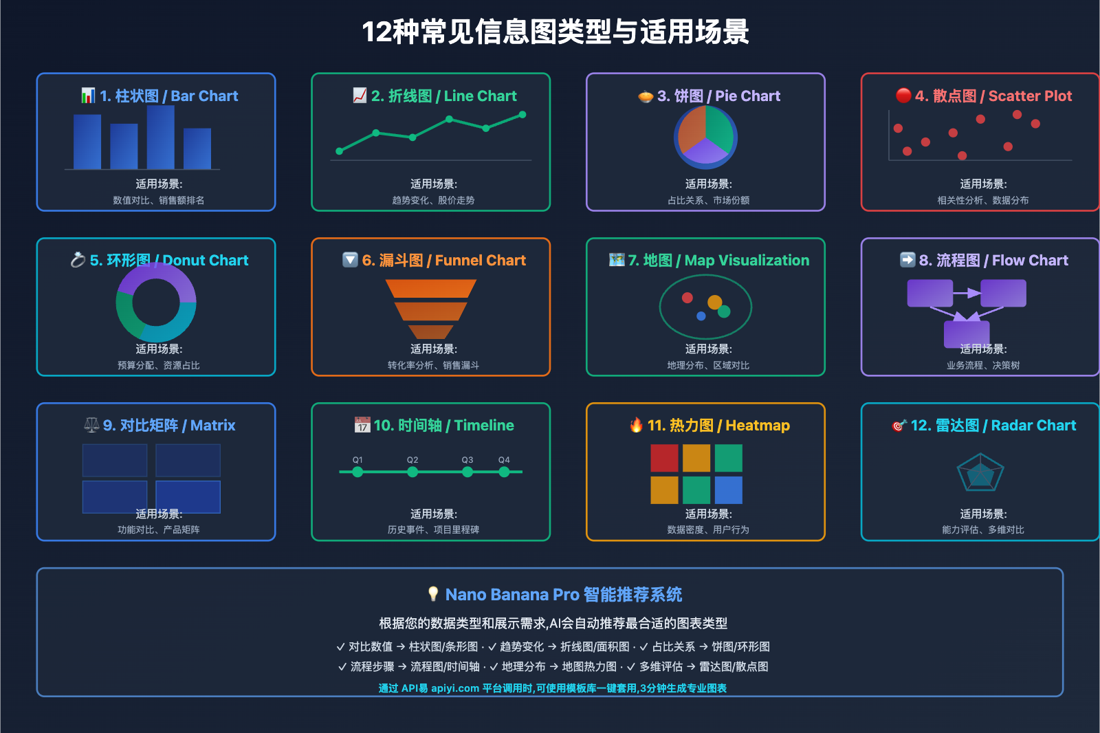
图表类型选择矩阵:
| 数据特征 | 推荐图表类型 | 适用场景 |
|---|---|---|
| 对比数值 | 柱状图/条形图 | 销售额对比、性能对比 |
| 占比关系 | 饼图/环形图 | 市场份额、预算分配 |
| 时间趋势 | 折线图/面积图 | 股价走势、用户增长 |
| 分布情况 | 散点图/热力图 | 客户分布、数据密度 |
| 流程步骤 | 流程图/漏斗图 | 业务流程、转化路径 |
| 层级关系 | 树状图/旭日图 | 组织架构、分类体系 |
提示词设计模板:
# 第2步:设计提示词
prompt = f"""
Create a professional business infographic showing quarterly sales performance:

DATA VISUALIZATION:
{data_description}

CHART TYPE: Vertical bar chart with gradient fills

VISUAL STYLE:
- Clean corporate design with subtle shadows
- Color scheme: Blue gradient for bars (from #1e40af to #3b82f6)
- Highlight Q4 bar in gold/yellow (#f59e0b) to emphasize peak performance
- Modern sans-serif font for all text

LAYOUT REQUIREMENTS:
- Title at top center, large and bold
- Bar chart in center, bars evenly spaced
- Data labels above each bar showing dollar amount
- Growth rate percentage below each bar
- Highlight callout box pointing to Q4: "{sales_data['highlight']}"
- Clean white background with subtle grid lines

TEXT RENDERING:
- All text must be clear, legible, and perfectly spelled
- Numbers formatted with "$" and "M" suffix
- Percentages with "+" or "-" prefix

RESOLUTION: 2K (2048x2048) for presentation quality
"""

print("Step 2 Complete: Prompt designed")
提示词设计关键点:
- 明确图表类型: 在提示词开头直接说明(bar chart, pie chart, line graph等)
- 颜色语义: 指定符合数据含义的配色方案
- 文字要求: 强调"clear, legible, perfectly spelled"确保文字准确
- 布局描述: 详细说明各元素的位置关系
- 风格定位: 明确视觉风格(商务、科技、教育等)
💰 成本优化: 对于需要批量生成报告图表的场景,可以考虑通过 API易 apiyi.com 平台调用 Nano Banana Pro API。该平台提供图表模板库,可以快速套用预设的提示词模板,相比从零编写提示词可节省50%的时间成本,适合企业月度/季度报告的规模化生产。
第 3 步: 生成、验证与迭代优化
核心原则: 生成初稿后,验证数据准确性和视觉清晰度,必要时进行参数调整和重新生成。
生成与验证流程:
# 第3步:生成图表
response = model.generate_images(
prompt=prompt,
resolution="2K",
guidance_scale=7.5, # 适度引导,确保布局稳定
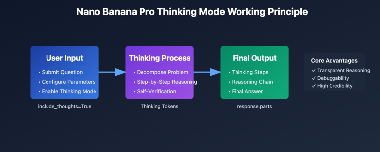
thinking_mode=True, # 启用思考模式,优化数据可视化逻辑
number_of_images=3 # 生成3个候选,挑选最佳
)
# 保存候选结果
for i, img in enumerate(response.images):
img.save(f"sales_chart_candidate_{i+1}.png")
print("Step 3 Complete: Charts generated")
# 验证清单
validation_checklist = {
"data_accuracy": "检查数值是否与源数据一致",
"text_clarity": "确认所有文字清晰可读、无拼写错误",
"color_scheme": "验证配色是否符合预期",
"layout_balance": "检查元素布局是否平衡美观",
"highlight_visible": "确认重点信息是否突出显示"
}
print("\n验证清单:")
for check, description in validation_checklist.items():
print(f"□ {description}")
迭代优化策略:
情况1: 文字渲染不清晰
- 解决方案: 在提示词中强调"large, bold, high-contrast text"
- 提高
resolution到 4K - 添加"ensure all numbers and labels are perfectly readable"
情况2: 数据点位置错误
- 解决方案: 明确指定每个数据点的位置
- 使用"left to right"或"top to bottom"等方位描述
- 启用
thinking_mode=True让模型先推理布局
情况3: 配色不符合预期
- 解决方案: 使用具体的十六进制颜色代码
- 提供参考图像指定配色风格
- 在提示词中说明配色的语义含义
完整迭代示例:
# 如果初稿不满意,优化提示词重新生成
improved_prompt = prompt + """

IMPORTANT REFINEMENTS:
- Increase font size for all labels to ensure readability
- Use bold weight for title and data values
- Add subtle drop shadow to bars for depth
- Ensure exact vertical alignment of bars
- Data labels must be positioned precisely above each bar center
"""

response_v2 = model.generate_images(
    prompt=improved_prompt,
    resolution="4K",  # 提高分辨率
    guidance_scale=8.0,  # 提高引导强度
    thinking_mode=True,
    seed=12345  # 固定种子便于对比调整效果
)

response_v2.images[0].save("sales_chart_final.png")
验证与质量控制:
def validate_infographic(image_path, expected_data):
    """验证信息图的数据准确性和视觉质量"""
    from PIL import Image
    import pytesseract  # OCR文字识别库

    img = Image.open(image_path)

    # 1. 文字识别验证
    extracted_text = pytesseract.image_to_string(img)

    # 2. 检查关键数字是否存在
    data_accuracy = all(
        str(value) in extracted_text
        for value in expected_data['sales_millions']
    )

    # 3. 检查标题是否正确
    title_correct = expected_data['title'] in extracted_text

    # 4. 分辨率验证
    resolution_ok = img.width >= 2048 and img.height >= 2048

    validation_result = {
        "data_accuracy": data_accuracy,
        "title_correct": title_correct,
        "resolution_ok": resolution_ok,
        "extracted_text_sample": extracted_text[:200]
    }

    return validation_result

# 验证最终结果
result = validate_infographic(
    "sales_chart_final.png",
    sales_data
)

if all([result['data_accuracy'], result['title_correct'], result['resolution_ok']]):
    print("✅ 信息图验证通过,可以使用")
else:
    print("❌ 需要优化,检测到以下问题:")
    for key, value in result.items():
        if not value and isinstance(value, bool):
            print(f"  - {key}")
技术要点:
- 使用OCR工具验证生成的文字内容
- 对比源数据确保数值准确无误
- 生成多个候选版本,人工挑选最佳
- 记录成功的提示词和参数配置,建立模板库
🎯 质量保障建议: API易 apiyi.com 平台提供智能质量检测功能,可以自动分析生成结果的文字准确度和数据一致性,并给出优化建议。企业用户可以配置自动化验证流程,确保批量生成的信息图100%符合数据规范和视觉标准。
Nano Banana Pro 信息图表类型实战
类型 1: 教育科普信息图
教育工作者需要将复杂概念可视化,帮助学生理解抽象知识。
应用场景: 科学原理图解、历史事件时间线、地理知识图表
实战案例: 生成"光合作用过程图解"
prompt = """
Create an educational infographic explaining the process of photosynthesis:

TITLE: "光合作用:植物如何制造食物" (Photosynthesis: How Plants Make Food)

CONTENT STRUCTURE:
1. Introduction box (top):
   - "植物 + 阳光 + 水 + 二氧化碳 → 氧气 + 葡萄糖"
   - Simple equation format with icons

2. Process Flow (center, left to right):
   Step 1: Sunlight absorption by chlorophyll (绿叶吸收阳光)
   - Icon: Sun rays hitting green leaf
   - Label: "叶绿素捕获光能"

   Step 2: Water uptake from roots (根部吸收水分)
   - Icon: Roots drawing water from soil
   - Label: "根系运输水分"

   Step 3: CO2 from air (空气中的二氧化碳)
   - Icon: Air molecules entering leaf stomata
   - Label: "气孔吸收CO₂"

   Step 4: Glucose production (生产葡萄糖)
   - Icon: Sugar molecule structure
   - Label: "光合作用产物"

   Step 5: Oxygen release (释放氧气)
   - Icon: O₂ molecules floating away
   - Label: "排出多余氧气"

3. Fun Fact box (bottom):
   - "💡 有趣的事实: 一棵树每年可以产生约260磅氧气!"

VISUAL STYLE:
- Bright, colorful, child-friendly illustrations
- Clear arrows showing process flow direction
- Green and blue color palette (nature theme)
- Large, easy-to-read Chinese and English labels
- Cartoon-style icons for accessibility

TEXT REQUIREMENTS:
- All Chinese text perfectly rendered without errors
- Scientific terms in both Chinese and English
- Bold headings, regular body text

TARGET AUDIENCE: Middle school students (ages 11-14)
RESOLUTION: 2K for classroom projection
"""

response = model.generate_images(
    prompt=prompt,
    resolution="2K",
    thinking_mode=True,
    guidance_scale=7.5
)

response.images[0].save("photosynthesis_infographic.png")
教育类信息图关键点:
- 使用生动的插图和图标增强理解
- 双语标注满足不同学习需求
- 流程清晰,步骤编号明确
- 配色明亮,吸引学生注意力
- 添加"趣味知识"增加互动性
🎯 教育场景建议: 对于教育机构和在线课程平台,我们建议通过 API易 apiyi.com 平台批量生成课程配图。该平台支持教育行业专属模板库,包含常见学科的信息图模板,可以快速定制生成整套课程的可视化素材,并提供教育行业优惠套餐。
类型 2: 商业数据报告图表
企业需要定期生成业务报告、财务分析等数据图表。
应用场景: 季度财报、市场分析、KPI仪表板
实战案例: 生成"2024年用户增长漏斗图"
prompt = """
Create a professional business funnel chart showing user conversion:

TITLE: "2024年用户转化漏斗分析" (2024 User Conversion Funnel Analysis)

DATA VISUALIZATION:
Funnel stages (top to bottom, narrowing):

Stage 1: Website Visitors (网站访客)
- Number: 100,000 users
- Percentage: 100%
- Color: Light blue (#60a5fa)

Stage 2: Sign-up Attempts (注册尝试)
- Number: 35,000 users
- Percentage: 35%
- Color: Medium blue (#3b82f6)
- Drop-off rate: -65% (shown in red)

Stage 3: Email Verified (邮箱验证)
- Number: 28,000 users
- Percentage: 28%
- Color: Dark blue (#1e40af)
- Drop-off rate: -7%

Stage 4: First Purchase (首次购买)
- Number: 8,400 users
- Percentage: 8.4%
- Color: Green (#10b981)
- Drop-off rate: -19.6%

Stage 5: Repeat Customer (复购客户)
- Number: 4,200 users
- Percentage: 4.2%
- Color: Dark green (#059669)
- Drop-off rate: -4.2%

KEY INSIGHTS (right side):
✓ 注册转化率35%,高于行业平均30%
✗ 首购转化率8.4%,需要优化
→ 建议:加强新用户引导和首单优惠

VISUAL STYLE:
- Clean corporate design with subtle gradients
- Professional color-coded stages
- Clear percentage labels on each funnel section
- Data numbers in large bold font
- Drop-off rates in small red text between stages
- White background with minimal decorative elements

LAYOUT:
- Funnel centered, occupying 60% width
- Insights box on right side, 35% width
- Title at top with company logo placeholder
- Legend at bottom showing color meanings

RESOLUTION: 4K for executive presentation
"""

response = model.generate_images(
    prompt=prompt,
    resolution="4K",
    thinking_mode=True,
    guidance_scale=8.0  # 高引导强度确保数据准确
)

response.images[0].save("conversion_funnel_2024.png")
商业报告图表关键点:
- 配色专业,符合企业VI规范
- 数据标注清晰,一目了然
- 突出关键指标和业务洞察
- 高分辨率输出适合大屏展示
- 简洁布局,避免视觉干扰
💰 企业级方案: 对于需要定期生成业务报告的企业,可以考虑通过 API易 apiyi.com 平台调用 Nano Banana Pro 的企业级API。该平台提供数据接口对接服务,可以直接从您的数据库或BI系统提取数据,自动生成标准化报告图表,相比手工制作可节省90%的时间成本。
类型 3: 社交媒体营销图表
社交媒体运营需要快速生成吸引眼球的数据可视化内容。
应用场景: Instagram/微信公众号配图、产品功能对比、用户评价展示
实战案例: 生成"产品功能对比矩阵"
prompt = """
Create a vibrant social media comparison infographic:

TITLE: "旗舰手机拍照功能对比" (Flagship Phone Camera Comparison)

COMPARISON MATRIX:
Four phones compared across 5 features:

         | iPhone 15 Pro | Samsung S24 | Pixel 8 Pro | Xiaomi 14 Pro
---------|---------------|-------------|-------------|---------------
夜景拍摄   | ⭐⭐⭐⭐⭐    | ⭐⭐⭐⭐     | ⭐⭐⭐⭐⭐    | ⭐⭐⭐⭐
变焦能力   | ⭐⭐⭐⭐     | ⭐⭐⭐⭐⭐    | ⭐⭐⭐       | ⭐⭐⭐⭐⭐
人像模式   | ⭐⭐⭐⭐⭐    | ⭐⭐⭐⭐     | ⭐⭐⭐⭐     | ⭐⭐⭐⭐
视频防抖   | ⭐⭐⭐⭐⭐    | ⭐⭐⭐⭐⭐    | ⭐⭐⭐⭐     | ⭐⭐⭐⭐
AI修图    | ⭐⭐⭐⭐     | ⭐⭐⭐⭐     | ⭐⭐⭐⭐⭐    | ⭐⭐⭐⭐

OVERALL WINNER: "🏆 Pixel 8 Pro - 综合评分最高!" (positioned below matrix)

VISUAL STYLE:
- Trendy social media aesthetic with bold colors
- Gradient background (light blue to purple)
- Phone brand logos at column headers
- Gold star icons for ratings (filled vs outlined)
- Modern rounded rectangles for matrix cells
- Playful emoji accents (🏆 ⭐ 📸 🎬)

TEXT STYLE:
- Title: Large, bold, gradient text effect
- Feature names: Clear Chinese characters
- Brand names: English, medium weight
- All text with subtle drop shadows for pop

LAYOUT:
- Title at top center
- Matrix in center, evenly spaced grid
- Winner callout at bottom with crown icon
- "Follow for more tech comparisons!" at very bottom
- Watermark: "@TechReview2024" corner

DIMENSIONS: Square 1080x1080 for Instagram
COLOR SCHEME: Bright, high contrast, social media friendly
"""

response = model.generate_images(
    prompt=prompt,
    resolution="1K",  # 1K足够社交媒体使用
    aspect_ratio="1:1",  # 方形适合Instagram
    guidance_scale=7.0
)

response.images[0].save("phone_comparison_social.png")
社交媒体图表关键点:
- 配色鲜艳,符合社交媒体审美
- 方形或竖版尺寸适配平台要求
- 信息简洁,3秒内传达核心信息
- 添加品牌水印和CTA引导
- 使用emoji和图标增加趣味性
类型 4: 学术论文配图
科研人员需要生成严谨的实验数据图表和研究流程图。
应用场景: 论文配图、实验结果展示、研究方法流程
实战案例: 生成"实验结果对比柱状图"
prompt = """
Create an academic research figure showing experimental results:

FIGURE TITLE: "Figure 3. Comparison of Treatment Efficacy Across Groups"

DATA VISUALIZATION:
Grouped bar chart comparing 3 treatment groups across 4 time points:

Time Points: Week 0, Week 4, Week 8, Week 12

Group A (Control - 对照组):
- Week 0: 45 ± 3.2
- Week 4: 47 ± 2.8
- Week 8: 48 ± 3.5
- Week 12: 49 ± 4.1

Group B (Treatment 1 - 实验组1):
- Week 0: 44 ± 2.9
- Week 4: 52 ± 3.1 *
- Week 8: 61 ± 4.2 **
- Week 12: 68 ± 3.8 ***

Group C (Treatment 2 - 实验组2):
- Week 0: 46 ± 3.5
- Week 4: 49 ± 2.7
- Week 8: 55 ± 3.9 *
- Week 12: 62 ± 4.5 **

STATISTICAL SIGNIFICANCE:
* p < 0.05
** p < 0.01
*** p < 0.001 (vs Control group)

VISUAL STYLE:
- Professional academic journal style
- Grayscale or subtle colors (white, light gray, dark gray)
- Group A: White bars with black outline
- Group B: Light gray fill (#d1d5db)
- Group C: Dark gray fill (#6b7280)
- Error bars showing ± standard deviation
- Asterisks above bars for significance markers

AXIS LABELS:
- X-axis: "Time Point (Weeks)"
- Y-axis: "Efficacy Score (arbitrary units)"
- Y-axis range: 0 to 80

LEGEND:
- Top right corner
- "□ Group A (n=30)"
- "■ Group B (n=32)"
- "■ Group C (n=28)"

CAPTION (below figure):
"Data presented as mean ± SD. Statistical analysis performed using two-way ANOVA with Bonferroni post-hoc test."

ACADEMIC REQUIREMENTS:
- Clean, publication-ready quality
- No decorative elements
- Clear, legible axis labels and numbers
- Professional font (Arial or Helvetica equivalent)
- High contrast for black-and-white printing

RESOLUTION: 4K (300 DPI equivalent for journal submission)
"""

response = model.generate_images(
    prompt=prompt,
    resolution="4K",
    thinking_mode=True,
    guidance_scale=8.5,  # 高精度确保数据准确
    temperature=0.6  # 降低随机性,确保科学严谨性
)

response.images[0].save("research_figure_3.png")
学术论文图表关键点:
- 配色保守,适合黑白印刷
- 标注完整,包含统计显著性标记
- 坐标轴清晰,单位明确
- 误差线/置信区间必须准确
- 图注(caption)包含实验细节
- 符合目标期刊的格式要求
🎯 学术研究建议: 对于科研机构和学术团队,我们建议通过 API易 apiyi.com 平台调用 Nano Banana Pro 生成论文配图。该平台支持学术规范的图表模板,包含Nature、Science等顶级期刊的格式预设,确保生成的图表符合投稿要求,并提供学术用户的教育优惠。
Nano Banana Pro 信息图表最佳实践
文字渲染优化技巧
中文渲染注意事项:
# 确保中文准确渲染的提示词模板
chinese_text_template = """
TEXT RENDERING REQUIREMENTS FOR CHINESE:
- Use standard simplified Chinese characters (简体中文)
- Font: Clear sans-serif style, similar to Microsoft YaHei or PingFang SC
- All Chinese text must be perfectly legible and correctly spelled
- No garbled characters or incorrect strokes
- Proper spacing between Chinese and English text
- Chinese punctuation marks (。、,;:?!) correctly rendered

CRITICAL: Double-check the following Chinese text is accurate:
[在此处列出所有需要渲染的中文文字]
"""
多语言混排处理:
prompt = """
Create a bilingual infographic (English + Chinese):

TITLE BILINGUAL FORMAT:
- Primary: "市场份额分析" (large, bold)
- Secondary: "Market Share Analysis" (smaller, below primary)

DATA LABELS:
- Numbers: 42.5% (universal format)
- Categories: "电子产品 / Electronics"
- Use "/" to separate languages clearly

FONT SELECTION:
- Chinese: Use fonts with good CJK support
- English: Sans-serif for modern look
- Ensure both languages have similar visual weight

LAYOUT:
- Chinese text slightly larger to compensate for complexity
- Adequate line spacing for mixed-language readability
"""
数据准确性验证流程
自动化验证脚本:
import pytesseract
from PIL import Image
import re

def verify_infographic_data(image_path, source_data):
    """
    验证信息图中的数据是否与源数据一致
    """
    # 1. OCR识别图像中的文字
    img = Image.open(image_path)
    extracted_text = pytesseract.image_to_string(img, lang='chi_sim+eng')

    # 2. 提取数字
    numbers_in_image = re.findall(r'\d+\.?\d*', extracted_text)
    numbers_in_source = [str(v) for v in source_data.values() if isinstance(v, (int, float))]

    # 3. 对比验证
    missing_numbers = set(numbers_in_source) - set(numbers_in_image)
    extra_numbers = set(numbers_in_image) - set(numbers_in_source)

    validation_report = {
        "accuracy_rate": len(set(numbers_in_source) & set(numbers_in_image)) / len(numbers_in_source) * 100,
        "missing_data": list(missing_numbers),
        "extra_data": list(extra_numbers),
        "pass": len(missing_numbers) == 0
    }

    return validation_report

# 使用示例
source_data = {"Q1": 120, "Q2": 145, "Q3": 138, "Q4": 162}
report = verify_infographic_data("sales_chart.png", source_data)

if report["pass"]:
    print(f"✅ 数据验证通过 (准确率: {report['accuracy_rate']:.1f}%)")
else:
    print(f"❌ 数据验证失败,缺失数据: {report['missing_data']}")
批量生成与模板化
建立信息图模板库:
# 定义可复用的模板
INFOGRAPHIC_TEMPLATES = {
    "quarterly_report": {
        "chart_type": "bar chart",
        "color_scheme": "corporate blue gradient",
        "layout": "title top, chart center, insights bottom",
        "resolution": "4K"
    },
    "social_comparison": {
        "chart_type": "comparison matrix",
        "color_scheme": "vibrant social media colors",
        "layout": "title top, matrix center, CTA bottom",
        "resolution": "1K",
        "aspect_ratio": "1:1"
    },
    "educational_process": {
        "chart_type": "flow diagram",
        "color_scheme": "bright educational colors",
        "layout": "linear left-to-right flow",
        "resolution": "2K"
    }
}

def generate_from_template(template_name, data, custom_options={}):
    """
    使用模板快速生成信息图
    """
    template = INFOGRAPHIC_TEMPLATES[template_name]

    # 合并模板配置和自定义选项
    config = {**template, **custom_options}

    # 构建提示词
    prompt = f"""
    Create a {config['chart_type']} infographic:

    DATA: {data}

    VISUAL STYLE:
    - Color scheme: {config['color_scheme']}
    - Layout: {config['layout']}

    [... 其余标准化描述 ...]
    """

    response = model.generate_images(
        prompt=prompt,
        resolution=config['resolution'],
        aspect_ratio=config.get('aspect_ratio', '16:9')
    )

    return response.images[0]

# 使用模板批量生成
quarterly_data = {
    "Q1": {"sales": 120, "growth": "+15%"},
    "Q2": {"sales": 145, "growth": "+21%"},
    "Q3": {"sales": 138, "growth": "-5%"},
    "Q4": {"sales": 162, "growth": "+17%"}
}

chart = generate_from_template("quarterly_report", quarterly_data)
chart.save("Q4_2024_report.png")
💡 模板库建议: 通过 API易 apiyi.com 平台调用时,可以使用平台提供的信息图模板库。该库包含30+种常用信息图类型,支持一键套用和参数化定制,无需编写复杂提示词,适合快速响应业务需求的场景。
Nano Banana Pro 信息图表常见问题解答
如何处理复杂的表格数据?
Nano Banana Pro 支持渲染复杂表格,但需要注意:
推荐做法:
- 表格行列数控制在5×5以内,过大的表格建议拆分
- 使用清晰的边框和背景色区分表头和数据区
- 关键数据用颜色或粗体突出
提示词示例:
prompt = """
Create a data table visualization:

TABLE STRUCTURE:
3 columns x 5 rows (including header)

| 产品类别 | 2023销售额 | 2024销售额 | 增长率 |
|---------|----------|----------|--------|
| 笔记本电脑 | $2.5M | $3.2M | +28% ↑ |
| 平板电脑 | $1.8M | $1.9M | +6% → |
| 智能手机 | $4.2M | $3.8M | -10% ↓ |
| 智能手表 | $0.9M | $1.5M | +67% ↑↑ |

VISUAL REQUIREMENTS:
- Header row: Dark blue background, white bold text
- Data rows: Alternating white and light gray backgrounds
- Borders: Thin gray lines between cells
- Growth rate column: Color-coded (green for positive, red for negative)
- Arrows: ↑ (green), → (gray), ↓ (red)
- All numbers right-aligned, text left-aligned
"""
技术要点:
- 明确指定表头和数据区的样式差异
- 使用颜色编码增强信息传递
- 对齐方式影响专业度,数字右对齐是惯例
生成的信息图文字模糊怎么办?
常见原因和解决方案:
-
分辨率不足
- 问题: 使用1K分辨率生成用于印刷的图表
- 解决: 提升到4K分辨率,确保300 DPI输出
-
字体过小
- 问题: 提示词未明确字号要求
- 解决: 添加"large, bold font"描述
-
对比度不足
- 问题: 浅灰色文字在白色背景上不清晰
- 解决: 要求"high-contrast text, dark on light"
优化提示词示例:
improved_prompt = original_prompt + """

TEXT CLARITY ENHANCEMENTS:
- Minimum font size: 16pt for body text, 32pt for headings
- Font weight: Bold for all data labels and numbers
- Text color: Pure black (#000000) on white background
- Add subtle drop shadow to text for depth (optional)
- Ensure 4.5:1 contrast ratio (WCAG AA standard)
"""
如何确保品牌配色一致性?
品牌色管理策略:
# 定义品牌配色规范
BRAND_COLORS = {
    "primary": "#1e40af",    # 品牌主色
    "secondary": "#10b981",  # 辅助色
    "accent": "#f59e0b",     # 强调色
    "text_dark": "#1f2937",  # 深色文字
    "text_light": "#6b7280", # 浅色文字
    "background": "#ffffff", # 背景色
}

# 在提示词中明确指定
prompt = f"""
Create an infographic using our brand color palette:

BRAND COLOR SCHEME (MUST FOLLOW EXACTLY):
- Primary color: {BRAND_COLORS['primary']} (for main elements)
- Secondary color: {BRAND_COLORS['secondary']} (for positive data)
- Accent color: {BRAND_COLORS['accent']} (for highlights)
- Text: {BRAND_COLORS['text_dark']} on {BRAND_COLORS['background']}

IMPORTANT: Use ONLY these exact hex colors, no variations or similar colors
"""
验证配色一致性:
from PIL import Image
import numpy as np

def verify_brand_colors(image_path, brand_palette, tolerance=30):
    """
    验证图像是否使用了品牌配色
    tolerance: 允许的颜色偏差范围(RGB值)
    """
    img = Image.open(image_path)
    pixels = np.array(img)

    # 提取主要颜色
    unique_colors = np.unique(pixels.reshape(-1, 3), axis=0)

    # 检查是否在品牌色范围内
    brand_rgb = [
        tuple(int(hex_color.lstrip('#')[i:i+2], 16) for i in (0, 2, 4))
        for hex_color in brand_palette.values()
    ]

    colors_match = []
    for color in unique_colors:
        matches = any(
            all(abs(color[i] - brand[i]) <= tolerance for i in range(3))
            for brand in brand_rgb
        )
        colors_match.append(matches)

    compliance_rate = sum(colors_match) / len(colors_match) * 100

    return {
        "compliance_rate": compliance_rate,
        "pass": compliance_rate >= 80,  # 80%以上颜色符合品牌规范
        "total_colors": len(unique_colors)
    }

# 使用示例
result = verify_brand_colors("infographic.png", BRAND_COLORS)
print(f"品牌色合规率: {result['compliance_rate']:.1f}%")
🎯 品牌规范建议: API易 apiyi.com 平台支持上传企业VI规范文件,系统会自动提取品牌配色并应用到所有生成任务中,确保100%的品牌一致性。企业用户还可以设置自动审核规则,不符合品牌规范的生成结果会被自动标记并重新生成。
Nano Banana Pro vs 其他工具(Canva/Figma/PowerPoint)对比?
| 特性 | Nano Banana Pro | Canva | Figma | PowerPoint |
|---|---|---|---|---|
| 文字渲染准确率 | ✅ 97%+ | ✅ 100% (手动) | ✅ 100% (手动) | ✅ 100% (手动) |
| AI自动生成 | ✅ 完全自动 | ⚠️ 模板+手动 | ❌ 手动设计 | ⚠️ 模板+手动 |
| 多语言支持 | ✅ 12+ 语言 | ✅ 多语言 | ✅ 多语言 | ✅ 多语言 |
| 分辨率 | ✅ 1K/2K/4K | ✅ 可调 | ✅ 矢量/像素 | ⚠️ 受限 |
| 批量生成 | ✅ API支持 | ⚠️ 有限 | ❌ 不支持 | ❌ 不支持 |
| 学习曲线 | ✅ 低(文本描述) | ⚠️ 中等 | ⚠️ 较高 | ✅ 低 |
| 定制灵活性 | ⚠️ 受提示词限制 | ✅ 完全控制 | ✅ 完全控制 | ✅ 完全控制 |
| 成本 | 中等(API调用) | 免费+付费 | 免费+付费 | 订阅制 |
最佳选择建议:
- 快速原型/批量生成: Nano Banana Pro (自动化优势)
- 精细设计控制: Figma (设计师首选)
- 社交媒体速成: Canva (模板丰富)
- 企业日常汇报: PowerPoint (兼容性好)
组合使用策略:
- 使用 Nano Banana Pro 快速生成初稿
- 导出高分辨率PNG
- 在 Figma/PowerPoint 中进行细节调整
- 最终输出用于发布或印刷
总结与展望
Nano Banana Pro 的数据可视化和信息图表生成能力,为内容创作者、教育工作者和企业用户带来了前所未有的效率提升。通过本文介绍的数据可视化3步法,用户可以实现:
- 效率提升: 从数小时的手工设计缩短到3-5分钟的自动生成
- 质量保证: 97%+的文字准确率和专业级视觉效果
- 规模化生产: 批量生成标准化图表,满足大量内容需求
- 多场景适配: 教育、商业、学术、社交媒体全覆盖
随着 Gemini 3 Pro 系列模型的持续优化,我们预期信息图表生成功能将进一步增强:
- 支持更复杂的数据可视化类型(交互式图表、动态仪表板)
- 提供更精细的样式控制(字体选择、布局微调)
- 实时数据源集成(自动从数据库提取数据生成图表)
- 跨平台格式输出(SVG矢量图、PDF、动画GIF)
对于内容创作者和企业而言,现在是采用AI辅助数据可视化的最佳时机。建议从小规模测试开始,逐步建立自己的图表模板库和工作流,充分发挥 Nano Banana Pro 在自动化和效率方面的独特优势。
🚀 立即开始: 推荐通过 API易 apiyi.com 平台快速体验 Nano Banana Pro 信息图表生成功能。该平台提供免费试用额度,支持在线数据输入和模板选择,无需编写代码即可开始实验。企业用户可以申请定制化图表模板和批量生成方案,加速数据可视化能力在业务场景中的落地应用。