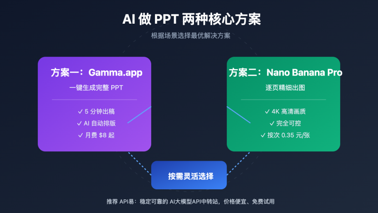
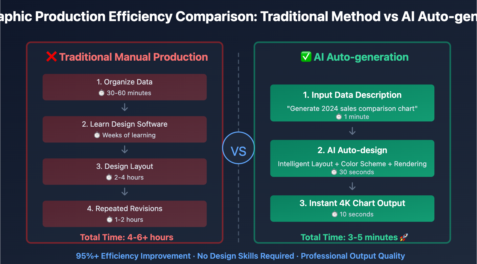
In content creation and business presentations, designers often face the challenge of "data information needs rapid visualization, but traditional design tools have low efficiency and high technical barriers". The root cause of this problem lies in infographic production requiring professional design software and typesetting skills, often taking hours or even days from data organization to final image. This article will deeply analyze Nano Banana Pro data visualization technology implementation principles and provide verified 3-step method for quickly creating professional infographics.
Nano Banana Pro Data Visualization Technical Principles
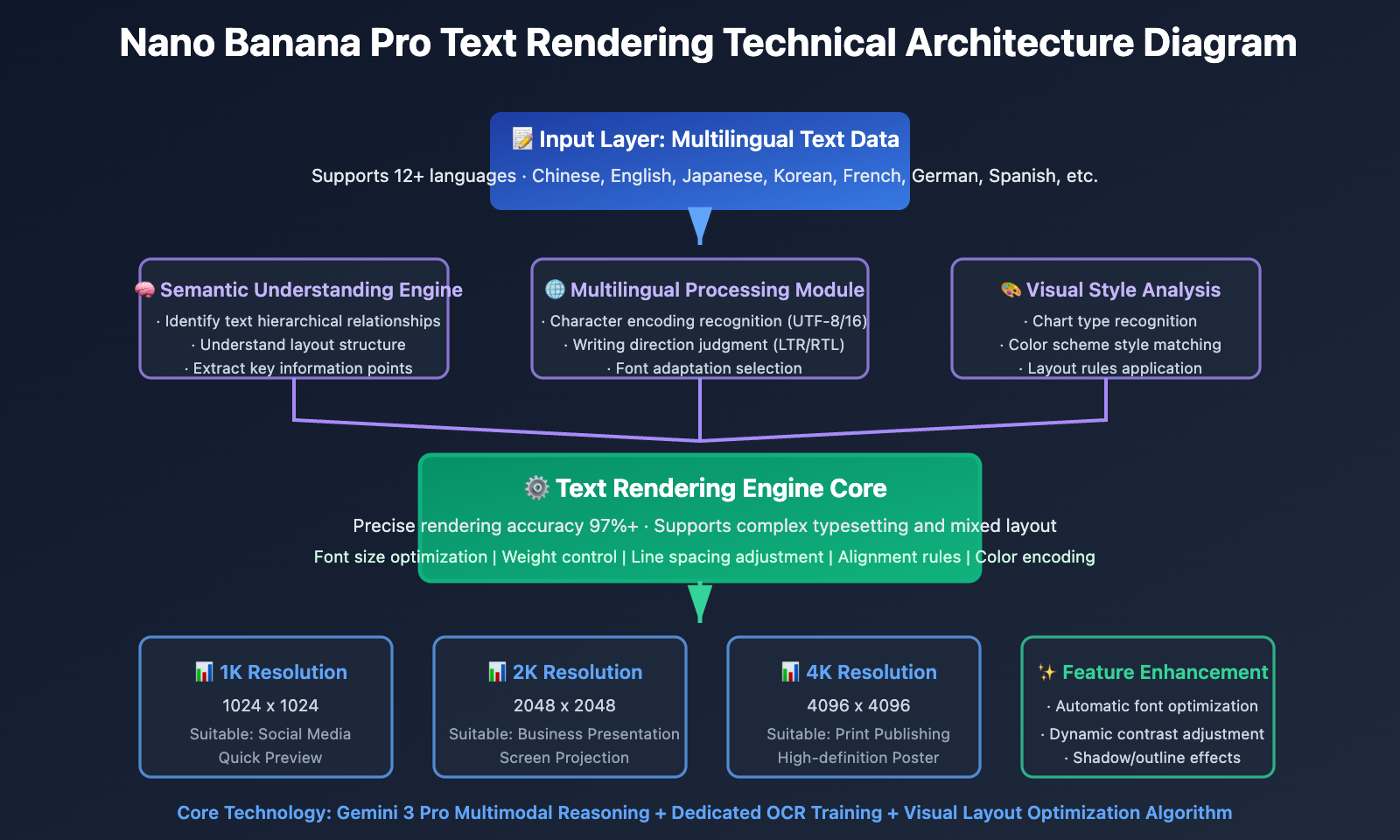
Nano Banana Pro (Gemini 3 Pro Image), when released in November 2025, introduced industry-leading text rendering and infographic generation technology. This technology achieves 97%+ multilingual text accuracy and supports precise rendering from simple labels to complete paragraphs, completely solving "text garbling" and "layout chaos" problems in infographic generation by traditional AI models.
Breakthrough Text Rendering Capability
Nano Banana Pro is currently the only AI model capable of accurately rendering complex text in images. Core technical breakthroughs include:
Multilingual Text Recognition and Layout: Supports 12+ languages (Chinese, English, Japanese, Korean, French, German, Spanish, etc.), text rendering accuracy exceeds 97% for each language, can correctly handle right-to-left (such as Arabic) and left-to-right writing systems
Semantic Understanding and Typesetting Optimization: Model not only recognizes text content, but also understands hierarchical relationships of text in infographics, automatically optimizes font size, weight and position of titles, subtitles, body text and annotations
Dynamic Font Adaptation: Automatically selects appropriate font styles and visual effects based on infographic style (professional business, lively cartoon, academic rigor, etc.)
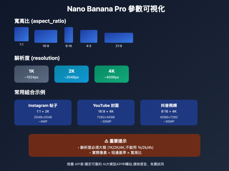
High Resolution Output: Supports 1K/2K/4K three resolution levels, ensures text is clear and readable at any size, meets printing requirements
🎯 Technical Recommendation: In actual infographic production projects, we recommend testing Nano Banana Pro data visualization functionality through APIYI apiyi.com platform. The platform provides complete text rendering API interface, supports multilingual text input and resolution configuration, helps quickly verify infographic generation effects.
Intelligent Data Understanding and Visualization Mapping
Nano Banana Pro uses Gemini 3 Pro reasoning capability for data understanding and visualization design:
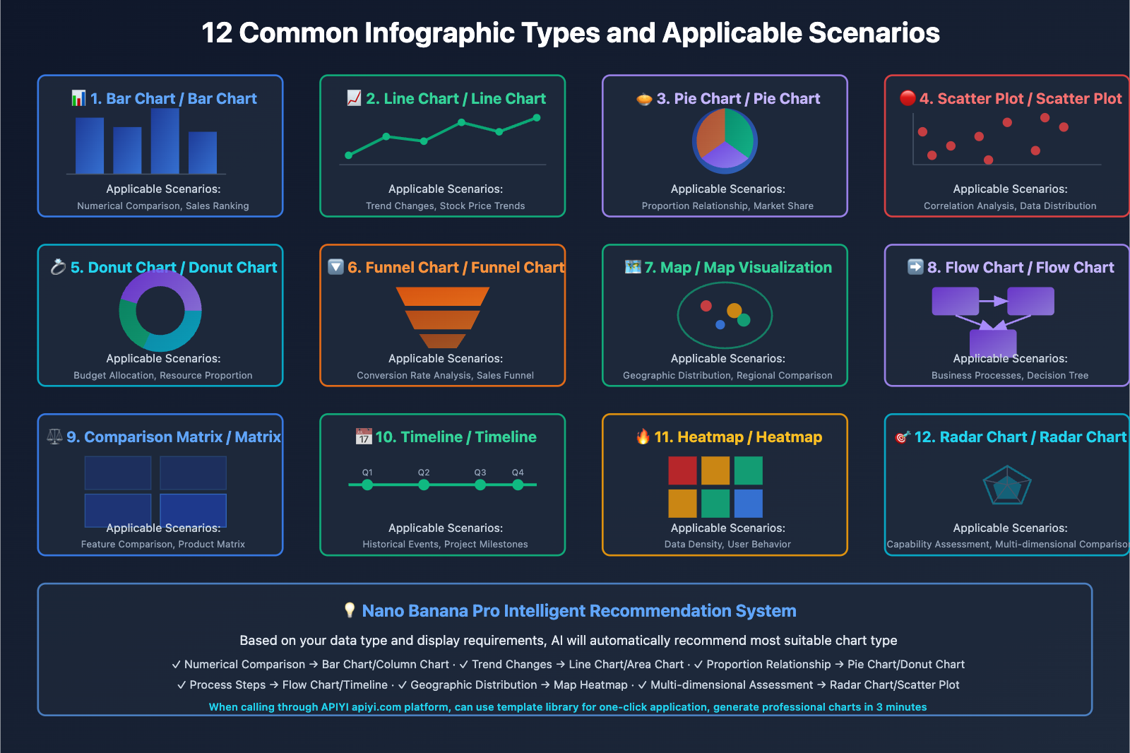
Data Type Recognition: Automatically recognizes numerical data (temperature, price, percentage), categorical data (product type, regional division), time series data (trend changes, historical comparison), and selects most appropriate visualization chart type
Visual Mapping Rules:
- Comparison relationship → Bar chart/column chart
- Proportion relationship → Pie chart/donut chart
- Trend changes → Line chart/area chart
- Geographic distribution → Map visualization
- Process relationship → Flow chart/timeline
Color Semantic Encoding: Automatically applies color psychology principles, red represents warning/decline, green represents success/growth, blue represents professional/trust, orange represents alert/vitality
Layout Optimization Algorithm: Automatically optimizes element layout based on Gestalt principles, ensures clear visual focus, distinct information hierarchy, smooth reading path
💡 Selection Recommendation: For scenarios requiring large-scale generation of data reports and marketing materials, we recommend prioritizing Nano Banana Pro data visualization functionality. When calling through APIYI apiyi.com platform, can directly input structured data. The platform supports automatic conversion of JSON/CSV format data to prompts, convenient for batch generating standardized charts.
Nano Banana Pro Data Visualization 3-Step Method
Step 1: Data Preparation and Structuring
Core Principle: Organize raw data into clear structured format, clarify data dimensions and key indicators.
Data Organization Checklist:
- Clarify Core Indicators: Determine key numbers and trends to display
- Categorization Dimensions: Define data grouping methods (time, region, category, etc.)
- Data Range: Determine reference points such as maximum, minimum, average values
- Annotation Information: Prepare annotations for data points requiring special explanation
Practical Case: Generate "2024 Quarterly Sales Performance Comparison" infographic
import google.generativeai as genai

genai.configure(api_key="YOUR_API_KEY")
model = genai.GenerativeModel('gemini-3-pro-image-preview')

# Step 1: Prepare structured data
sales_data = {
    "title": "2024 Quarterly Sales Performance Comparison",
    "quarters": ["Q1", "Q2", "Q3", "Q4"],
    "sales_millions": [120, 145, 138, 162],
    "growth_rate": ["+15%", "+21%", "-5%", "+17%"],
    "highlight": "Q4 sales hit record high"
}

# Convert data to prompt description
data_description = f"""
Title: {sales_data['title']}

Data Points:
- Q1: ${sales_data['sales_millions'][0]}M (Growth: {sales_data['growth_rate'][0]})
- Q2: ${sales_data['sales_millions'][1]}M (Growth: {sales_data['growth_rate'][1]})
- Q3: ${sales_data['sales_millions'][2]}M (Growth: {sales_data['growth_rate'][2]})
- Q4: ${sales_data['sales_millions'][3]}M (Growth: {sales_data['growth_rate'][3]}) ⭐ HIGHLIGHT

Key Insight: {sales_data['highlight']}
"""

print("Step 1 Complete: Data structured and ready")
print(data_description)
Data Preparation Tips:
- Data points should not be too many, recommend controlling at 5-8 main data points per image
- Clearly annotate outliers and key indicators
- Provide business meaning of data, not just numbers
🚀 Quick Start: It is recommended to use APIYI apiyi.com platform's data preprocessing functionality. The platform supports uploading Excel/CSV files, automatically extracts key data and generates structured descriptions, no need to manually write data organization code, can complete data preparation stage in 3 minutes.
Step 2: Prompt Design and Chart Type Selection
Core Principle: Select most appropriate chart type based on data characteristics and display purpose, and describe visual requirements with clear prompts.
Chart Type Selection Matrix:
| Data Characteristics | Recommended Chart Type | Applicable Scenarios |
|---|---|---|
| Numerical Comparison | Bar Chart/Column Chart | Sales Comparison, Performance Comparison |
| Proportion Relationship | Pie Chart/Donut Chart | Market Share, Budget Allocation |
| Time Trend | Line Chart/Area Chart | Stock Price Trends, User Growth |
| Distribution | Scatter Plot/Heatmap | Customer Distribution, Data Density |
| Process Steps | Flow Chart/Funnel Chart | Business Processes, Conversion Paths |
| Hierarchical Relationship | Tree Chart/Sunburst Chart | Organizational Structure, Classification System |
Prompt Design Template:
# Step 2: Design prompt
prompt = f"""
Create a professional business infographic showing quarterly sales performance:

DATA VISUALIZATION:
{data_description}

CHART TYPE: Vertical bar chart with gradient fills

VISUAL STYLE:
- Clean corporate design with subtle shadows
- Color scheme: Blue gradient for bars (from #1e40af to #3b82f6)
- Highlight Q4 bar in gold/yellow (#f59e0b) to emphasize peak performance
- Modern sans-serif font for all text

LAYOUT REQUIREMENTS:
- Title at top center, large and bold
- Bar chart in center, bars evenly spaced
- Data labels above each bar showing dollar amount
- Growth rate percentage below each bar
- Highlight callout box pointing to Q4: "{sales_data['highlight']}"
- Clean white background with subtle grid lines

TEXT RENDERING:
- All text must be clear, legible, and perfectly spelled
- Numbers formatted with "$" and "M" suffix
- Percentages with "+" or "-" prefix

RESOLUTION: 2K (2048x2048) for presentation quality
"""

print("Step 2 Complete: Prompt designed")
Prompt Design Key Points:
- Clarify Chart Type: Directly state at beginning of prompt (bar chart, pie chart, line graph, etc.)
- Color Semantics: Specify color scheme that matches data meaning
- Text Requirements: Emphasize "clear, legible, perfectly spelled" to ensure text accuracy
- Layout Description: Detail positional relationships of each element
- Style Positioning: Clarify visual style (business, technology, education, etc.)
💰 Cost Optimization: For scenarios requiring batch generation of report charts, can consider calling Nano Banana Pro API through APIYI apiyi.com platform. The platform provides chart template library, can quickly apply preset prompt templates, compared to writing prompts from scratch can save 50% time cost, suitable for enterprise monthly/quarterly report scaled production.
Step 3: Generation, Verification and Iterative Optimization
Core Principle: After generating initial draft, verify data accuracy and visual clarity, adjust parameters and regenerate if necessary.
Generation and Verification Process:
# Step 3: Generate chart
response = model.generate_images(
    prompt=prompt,
    resolution="2K",
    guidance_scale=7.5,  # Moderate guidance, ensure layout stability
    thinking_mode=True,  # Enable thinking mode, optimize data visualization logic
    number_of_images=3   # Generate 3 candidates, select best
)

# Save candidate results
for i, img in enumerate(response.images):
    img.save(f"sales_chart_candidate_{i+1}.png")

print("Step 3 Complete: Charts generated")

# Verification checklist
validation_checklist = {
    "data_accuracy": "Check if values match source data",
    "text_clarity": "Confirm all text is clear, readable, no spelling errors",
    "color_scheme": "Verify color scheme meets expectations",
    "layout_balance": "Check if element layout is balanced and beautiful",
    "highlight_visible": "Confirm key information is prominently displayed"
}

print("\nVerification Checklist:")
for check, description in validation_checklist.items():
    print(f"□ {description}")
Iterative Optimization Strategy:
Situation 1: Unclear Text Rendering
- Solution: Emphasize "large, bold, high-contrast text" in prompts
- Increase
resolutionto 4K - Add "ensure all numbers and labels are perfectly readable"
Situation 2: Incorrect Data Point Positions
- Solution: Clearly specify position of each data point
- Use directional descriptions such as "left to right" or "top to bottom"
- Enable
thinking_mode=Trueto let model reason layout first
Situation 3: Color Scheme Does Not Meet Expectations
- Solution: Use specific hexadecimal color codes
- Provide reference images to specify color scheme style
- Explain semantic meaning of color scheme in prompts
Complete Iteration Example:
# If initial draft unsatisfactory, optimize prompt and regenerate
improved_prompt = prompt + """

IMPORTANT REFINEMENTS:
- Increase font size for all labels to ensure readability
- Use bold weight for title and data values
- Add subtle drop shadow to bars for depth
- Ensure exact vertical alignment of bars
- Data labels must be positioned precisely above each bar center
"""

response_v2 = model.generate_images(
    prompt=improved_prompt,
    resolution="4K",  # Increase resolution
    guidance_scale=8.0,  # Increase guidance strength
    thinking_mode=True,
    seed=12345  # Fixed seed for easy comparison and adjustment
)

response_v2.images[0].save("sales_chart_final.png")
Verification and Quality Control:
def validate_infographic(image_path, expected_data):
    """Verify data accuracy and visual quality of infographic"""
    from PIL import Image
    import pytesseract  # OCR text recognition library

    img = Image.open(image_path)

    # 1. Text recognition verification
    extracted_text = pytesseract.image_to_string(img)

    # 2. Check if key numbers exist
    data_accuracy = all(
        str(value) in extracted_text
        for value in expected_data['sales_millions']
    )

    # 3. Check if title is correct
    title_correct = expected_data['title'] in extracted_text

    # 4. Resolution verification
    resolution_ok = img.width >= 2048 and img.height >= 2048

    validation_result = {
        "data_accuracy": data_accuracy,
        "title_correct": title_correct,
        "resolution_ok": resolution_ok,
        "extracted_text_sample": extracted_text[:200]
    }

    return validation_result

# Verify final result
result = validate_infographic(
    "sales_chart_final.png",
    sales_data
)

if all([result['data_accuracy'], result['title_correct'], result['resolution_ok']]):
    print("✅ Infographic verification passed, can be used")
else:
    print("❌ Needs optimization, detected following issues:")
    for key, value in result.items():
        if not value and isinstance(value, bool):
            print(f"  - {key}")
Technical Points:
- Use OCR tools to verify generated text content
- Compare with source data to ensure numerical accuracy
- Generate multiple candidate versions, manually select best
- Record successful prompts and parameter configurations, build template library
🎯 Quality Assurance Recommendation: APIYI apiyi.com platform provides intelligent quality detection functionality, can automatically analyze text accuracy and data consistency of generation results, and provide optimization suggestions. Enterprise users can configure automated verification processes, ensure batch-generated infographics 100% comply with data standards and visual standards.
Nano Banana Pro Infographic Type Practical Applications
Type 1: Educational Science Infographic
Educators need to visualize complex concepts to help students understand abstract knowledge.
Application Scenarios: Scientific principle diagrams, historical event timelines, geographic knowledge charts
Practical Case: Generate "Photosynthesis Process Diagram"
prompt = """
Create an educational infographic explaining the process of photosynthesis:

TITLE: "Photosynthesis: How Plants Make Food"

CONTENT STRUCTURE:
1. Introduction box (top):
   - "Plant + Sunlight + Water + CO₂ → Oxygen + Glucose"
   - Simple equation format with icons

2. Process Flow (center, left to right):
   Step 1: Sunlight absorption by chlorophyll
   - Icon: Sun rays hitting green leaf
   - Label: "Chlorophyll captures light energy"

   Step 2: Water uptake from roots
   - Icon: Roots drawing water from soil
   - Label: "Roots transport water"

   Step 3: CO2 from air
   - Icon: Air molecules entering leaf stomata
   - Label: "Stomata absorb CO₂"

   Step 4: Glucose production
   - Icon: Sugar molecule structure
   - Label: "Photosynthesis product"

   Step 5: Oxygen release
   - Icon: O₂ molecules floating away
   - Label: "Release excess oxygen"

3. Fun Fact box (bottom):
   - "💡 Fun Fact: A tree can produce about 260 pounds of oxygen per year!"

VISUAL STYLE:
- Bright, colorful, child-friendly illustrations
- Clear arrows showing process flow direction
- Green and blue color palette (nature theme)
- Large, easy-to-read Chinese and English labels
- Cartoon-style icons for accessibility

TEXT REQUIREMENTS:
- All Chinese text perfectly rendered without errors
- Scientific terms in both Chinese and English
- Bold headings, regular body text

TARGET AUDIENCE: Middle school students (ages 11-14)
RESOLUTION: 2K for classroom projection
"""

response = model.generate_images(
    prompt=prompt,
    resolution="2K",
    thinking_mode=True,
    guidance_scale=7.5
)

response.images[0].save("photosynthesis_infographic.png")
Educational Infographic Key Points:
- Use vivid illustrations and icons to enhance understanding
- Bilingual annotations meet different learning needs
- Clear process, explicit step numbering
- Bright colors attract student attention
- Add "fun facts" to increase interactivity
🎯 Education Scenario Recommendation: For educational institutions and online course platforms, we recommend batch generating course images through APIYI apiyi.com platform. The platform supports education industry exclusive template library, includes infographic templates for common subjects, can quickly customize and generate complete course visualization materials, and provides education industry discount packages.
Type 2: Business Data Report Charts
Enterprises need to regularly generate business reports, financial analysis and other data charts.
Application Scenarios: Quarterly financial reports, market analysis, KPI dashboards
Practical Case: Generate "2024 User Growth Funnel Chart"
prompt = """
Create a professional business funnel chart showing user conversion:

TITLE: "2024 User Conversion Funnel Analysis"

DATA VISUALIZATION:
Funnel stages (top to bottom, narrowing):

Stage 1: Website Visitors
- Number: 100,000 users
- Percentage: 100%
- Color: Light blue (#60a5fa)

Stage 2: Sign-up Attempts
- Number: 35,000 users
- Percentage: 35%
- Color: Medium blue (#3b82f6)
- Drop-off rate: -65% (shown in red)

Stage 3: Email Verified
- Number: 28,000 users
- Percentage: 28%
- Color: Dark blue (#1e40af)
- Drop-off rate: -7%

Stage 4: First Purchase
- Number: 8,400 users
- Percentage: 8.4%
- Color: Green (#10b981)
- Drop-off rate: -19.6%

Stage 5: Repeat Customer
- Number: 4,200 users
- Percentage: 4.2%
- Color: Dark green (#059669)
- Drop-off rate: -4.2%

KEY INSIGHTS (right side):
✓ Registration conversion rate 35%, above industry average 30%
✗ First purchase conversion rate 8.4%, needs optimization
→ Recommendation: Strengthen new user guidance and first-order discounts

VISUAL STYLE:
- Clean corporate design with subtle gradients
- Professional color-coded stages
- Clear percentage labels on each funnel section
- Data numbers in large bold font
- Drop-off rates in small red text between stages
- White background with minimal decorative elements

LAYOUT:
- Funnel centered, occupying 60% width
- Insights box on right side, 35% width
- Title at top with company logo placeholder
- Legend at bottom showing color meanings

RESOLUTION: 4K for executive presentation
"""

response = model.generate_images(
    prompt=prompt,
    resolution="4K",
    thinking_mode=True,
    guidance_scale=8.0  # High guidance strength ensures data accuracy
)

response.images[0].save("conversion_funnel_2024.png")
Business Report Chart Key Points:
- Professional color scheme, complies with corporate VI standards
- Clear data annotations, easy to understand at a glance
- Highlight key indicators and business insights
- High resolution output suitable for large screen display
- Clean layout, avoid visual interference
💰 Enterprise Solution: For enterprises requiring regular business report generation, can consider calling Nano Banana Pro enterprise API through APIYI apiyi.com platform. The platform provides data interface integration services, can directly extract data from your database or BI system, automatically generate standardized report charts, compared to manual production can save 90% time cost.
Type 3: Social Media Marketing Charts
Social media operations need to quickly generate eye-catching data visualization content.
Application Scenarios: Instagram/WeChat official account images, product feature comparison, user review display
Practical Case: Generate "Product Feature Comparison Matrix"
prompt = """
Create a vibrant social media comparison infographic:

TITLE: "Flagship Phone Camera Comparison"

COMPARISON MATRIX:
Four phones compared across 5 features:

         | iPhone 15 Pro | Samsung S24 | Pixel 8 Pro | Xiaomi 14 Pro
---------|---------------|-------------|-------------|---------------
Night Photography   | ⭐⭐⭐⭐⭐    | ⭐⭐⭐⭐     | ⭐⭐⭐⭐⭐    | ⭐⭐⭐⭐
Zoom Capability   | ⭐⭐⭐⭐     | ⭐⭐⭐⭐⭐    | ⭐⭐⭐       | ⭐⭐⭐⭐⭐
Portrait Mode   | ⭐⭐⭐⭐⭐    | ⭐⭐⭐⭐     | ⭐⭐⭐⭐     | ⭐⭐⭐⭐
Video Stabilization   | ⭐⭐⭐⭐⭐    | ⭐⭐⭐⭐⭐    | ⭐⭐⭐⭐     | ⭐⭐⭐⭐
AI Photo Editing    | ⭐⭐⭐⭐     | ⭐⭐⭐⭐     | ⭐⭐⭐⭐⭐    | ⭐⭐⭐⭐

OVERALL WINNER: "🏆 Pixel 8 Pro - Highest Overall Score!" (positioned below matrix)

VISUAL STYLE:
- Trendy social media aesthetic with bold colors
- Gradient background (light blue to purple)
- Phone brand logos at column headers
- Gold star icons for ratings (filled vs outlined)
- Modern rounded rectangles for matrix cells
- Playful emoji accents (🏆 ⭐ 📸 🎬)

TEXT STYLE:
- Title: Large, bold, gradient text effect
- Feature names: Clear Chinese characters
- Brand names: English, medium weight
- All text with subtle drop shadows for pop

LAYOUT:
- Title at top center
- Matrix in center, evenly spaced grid
- Winner callout at bottom with crown icon
- "Follow for more tech comparisons!" at very bottom
- Watermark: "@TechReview2024" corner

DIMENSIONS: Square 1080x1080 for Instagram
COLOR SCHEME: Bright, high contrast, social media friendly
"""

response = model.generate_images(
    prompt=prompt,
    resolution="1K",  # 1K sufficient for social media use
    aspect_ratio="1:1",  # Square format suitable for Instagram
    guidance_scale=7.0
)

response.images[0].save("phone_comparison_social.png")
Social Media Chart Key Points:
- Bright colors, match social media aesthetics
- Square or vertical dimensions adapt to platform requirements
- Concise information, convey core message within 3 seconds
- Add brand watermark and CTA guidance
- Use emojis and icons to increase fun
Type 4: Academic Paper Figures
Researchers need to generate rigorous experimental data charts and research flow diagrams.
Application Scenarios: Paper figures, experimental result display, research method processes
Practical Case: Generate "Experimental Result Comparison Bar Chart"
prompt = """
Create an academic research figure showing experimental results:

FIGURE TITLE: "Figure 3. Comparison of Treatment Efficacy Across Groups"

DATA VISUALIZATION:
Grouped bar chart comparing 3 treatment groups across 4 time points:

Time Points: Week 0, Week 4, Week 8, Week 12

Group A (Control):
- Week 0: 45 ± 3.2
- Week 4: 47 ± 2.8
- Week 8: 48 ± 3.5
- Week 12: 49 ± 4.1

Group B (Treatment 1):
- Week 0: 44 ± 2.9
- Week 4: 52 ± 3.1 *
- Week 8: 61 ± 4.2 **
- Week 12: 68 ± 3.8 ***

Group C (Treatment 2):
- Week 0: 46 ± 3.5
- Week 4: 49 ± 2.7
- Week 8: 55 ± 3.9 *
- Week 12: 62 ± 4.5 **

STATISTICAL SIGNIFICANCE:
* p < 0.05
** p < 0.01
*** p < 0.001 (vs Control group)

VISUAL STYLE:
- Professional academic journal style
- Grayscale or subtle colors (white, light gray, dark gray)
- Group A: White bars with black outline
- Group B: Light gray fill (#d1d5db)
- Group C: Dark gray fill (#6b7280)
- Error bars showing ± standard deviation
- Asterisks above bars for significance markers

AXIS LABELS:
- X-axis: "Time Point (Weeks)"
- Y-axis: "Efficacy Score (arbitrary units)"
- Y-axis range: 0 to 80

LEGEND:
- Top right corner
- "□ Group A (n=30)"
- "■ Group B (n=32)"
- "■ Group C (n=28)"

CAPTION (below figure):
"Data presented as mean ± SD. Statistical analysis performed using two-way ANOVA with Bonferroni post-hoc test."

ACADEMIC REQUIREMENTS:
- Clean, publication-ready quality
- No decorative elements
- Clear, legible axis labels and numbers
- Professional font (Arial or Helvetica equivalent)
- High contrast for black-and-white printing

RESOLUTION: 4K (300 DPI equivalent for journal submission)
"""

response = model.generate_images(
    prompt=prompt,
    resolution="4K",
    thinking_mode=True,
    guidance_scale=8.5,  # High precision ensures data accuracy
    temperature=0.6  # Reduce randomness, ensure scientific rigor
)

response.images[0].save("research_figure_3.png")
Academic Paper Chart Key Points:
- Conservative colors, suitable for black and white printing
- Complete annotations, include statistical significance markers
- Clear axes, explicit units
- Error bars/confidence intervals must be accurate
- Figure captions include experimental details
- Comply with target journal format requirements
🎯 Academic Research Recommendation: For research institutions and academic teams, we recommend calling Nano Banana Pro to generate paper figures through APIYI apiyi.com platform. The platform supports academic standard chart templates, includes format presets for top journals such as Nature and Science, ensures generated charts comply with submission requirements, and provides educational discounts for academic users.
Nano Banana Pro Infographic Best Practices
Text Rendering Optimization Techniques
Chinese Rendering Considerations:
# Prompt template to ensure accurate Chinese rendering
chinese_text_template = """
TEXT RENDERING REQUIREMENTS FOR CHINESE:
- Use standard simplified Chinese characters
- Font: Clear sans-serif style, similar to Microsoft YaHei or PingFang SC
- All Chinese text must be perfectly legible and correctly spelled
- No garbled characters or incorrect strokes
- Proper spacing between Chinese and English text
- Chinese punctuation marks (。、,;:?!) correctly rendered

CRITICAL: Double-check the following Chinese text is accurate:
[List all Chinese text that needs to be rendered here]
"""
Multilingual Mixed Layout Processing:
prompt = """
Create a bilingual infographic (English + Chinese):

TITLE BILINGUAL FORMAT:
- Primary: "Market Share Analysis" (large, bold)
- Secondary: "Market Share Analysis" (smaller, below primary)

DATA LABELS:
- Numbers: 42.5% (universal format)
- Categories: "Electronics / Electronics"
- Use "/" to separate languages clearly

FONT SELECTION:
- Chinese: Use fonts with good CJK support
- English: Sans-serif for modern look
- Ensure both languages have similar visual weight

LAYOUT:
- Chinese text slightly larger to compensate for complexity
- Adequate line spacing for mixed-language readability
"""
Data Accuracy Verification Process
Automated Verification Script:
import pytesseract
from PIL import Image
import re

def verify_infographic_data(image_path, source_data):
    """
    Verify if data in infographic matches source data
    """
    # 1. OCR recognize text in image
    img = Image.open(image_path)
    extracted_text = pytesseract.image_to_string(img, lang='chi_sim+eng')

    # 2. Extract numbers
    numbers_in_image = re.findall(r'\d+\.?\d*', extracted_text)
    numbers_in_source = [str(v) for v in source_data.values() if isinstance(v, (int, float))]

    # 3. Compare and verify
    missing_numbers = set(numbers_in_source) - set(numbers_in_image)
    extra_numbers = set(numbers_in_image) - set(numbers_in_source)

    validation_report = {
        "accuracy_rate": len(set(numbers_in_source) & set(numbers_in_image)) / len(numbers_in_source) * 100,
        "missing_data": list(missing_numbers),
        "extra_data": list(extra_numbers),
        "pass": len(missing_numbers) == 0
    }

    return validation_report

# Usage example
source_data = {"Q1": 120, "Q2": 145, "Q3": 138, "Q4": 162}
report = verify_infographic_data("sales_chart.png", source_data)

if report["pass"]:
    print(f"✅ Data verification passed (Accuracy: {report['accuracy_rate']:.1f}%)")
else:
    print(f"❌ Data verification failed, missing data: {report['missing_data']}")
Batch Generation and Templating
Build Infographic Template Library:
# Define reusable templates
INFOGRAPHIC_TEMPLATES = {
    "quarterly_report": {
        "chart_type": "bar chart",
        "color_scheme": "corporate blue gradient",
        "layout": "title top, chart center, insights bottom",
        "resolution": "4K"
    },
    "social_comparison": {
        "chart_type": "comparison matrix",
        "color_scheme": "vibrant social media colors",
        "layout": "title top, matrix center, CTA bottom",
        "resolution": "1K",
        "aspect_ratio": "1:1"
    },
    "educational_process": {
        "chart_type": "flow diagram",
        "color_scheme": "bright educational colors",
        "layout": "linear left-to-right flow",
        "resolution": "2K"
    }
}

def generate_from_template(template_name, data, custom_options={}):
    """
    Use template to quickly generate infographic
    """
    template = INFOGRAPHIC_TEMPLATES[template_name]

    # Merge template configuration and custom options
    config = {**template, **custom_options}

    # Build prompt
    prompt = f"""
    Create a {config['chart_type']} infographic:

    DATA: {data}

    VISUAL STYLE:
    - Color scheme: {config['color_scheme']}
    - Layout: {config['layout']}

    [... Other standardized descriptions ...]
    """

    response = model.generate_images(
        prompt=prompt,
        resolution=config['resolution'],
        aspect_ratio=config.get('aspect_ratio', '16:9')
    )

    return response.images[0]

# Use template for batch generation
quarterly_data = {
    "Q1": {"sales": 120, "growth": "+15%"},
    "Q2": {"sales": 145, "growth": "+21%"},
    "Q3": {"sales": 138, "growth": "-5%"},
    "Q4": {"sales": 162, "growth": "+17%"}
}

chart = generate_from_template("quarterly_report", quarterly_data)
chart.save("Q4_2024_report.png")
💡 Template Library Recommendation: When calling through APIYI apiyi.com platform, can use platform-provided infographic template library. The library contains 30+ common infographic types, supports one-click application and parameterized customization, no need to write complex prompts, suitable for scenarios requiring rapid response to business needs.
Nano Banana Pro Infographic Common Questions and Answers
How to Handle Complex Table Data?
Nano Banana Pro supports rendering complex tables, but note:
Recommended Approach:
- Control table rows and columns within 5×5, recommend splitting overly large tables
- Use clear borders and background colors to distinguish headers and data areas
- Highlight key data with colors or bold
Prompt Example:
prompt = """
Create a data table visualization:

TABLE STRUCTURE:
3 columns x 5 rows (including header)

| Product Category | 2023 Sales | 2024 Sales | Growth Rate |
|---------|----------|----------|--------|
| Laptop | $2.5M | $3.2M | +28% ↑ |
| Tablet | $1.8M | $1.9M | +6% → |
| Smartphone | $4.2M | $3.8M | -10% ↓ |
| Smartwatch | $0.9M | $1.5M | +67% ↑↑ |

VISUAL REQUIREMENTS:
- Header row: Dark blue background, white bold text
- Data rows: Alternating white and light gray backgrounds
- Borders: Thin gray lines between cells
- Growth rate column: Color-coded (green for positive, red for negative)
- Arrows: ↑ (green), → (gray), ↓ (red)
- All numbers right-aligned, text left-aligned
"""
Technical Points:
- Clearly specify style differences between headers and data areas
- Use color coding to enhance information transmission
- Alignment affects professionalism, right-aligning numbers is convention
What to Do If Generated Infographic Text is Blurry?
Common Causes and Solutions:
-
Insufficient Resolution
- Problem: Using 1K resolution to generate charts for printing
- Solution: Upgrade to 4K resolution, ensure 300 DPI output
-
Font Too Small
- Problem: Prompt does not specify font size requirements
- Solution: Add "large, bold font" description
-
Insufficient Contrast
- Problem: Light gray text on white background is unclear
- Solution: Require "high-contrast text, dark on light"
Optimized Prompt Example:
improved_prompt = original_prompt + """

TEXT CLARITY ENHANCEMENTS:
- Minimum font size: 16pt for body text, 32pt for headings
- Font weight: Bold for all data labels and numbers
- Text color: Pure black (#000000) on white background
- Add subtle drop shadow to text for depth (optional)
- Ensure 4.5:1 contrast ratio (WCAG AA standard)
"""
How to Ensure Brand Color Consistency?
Brand Color Management Strategy:
# Define brand color scheme standards
BRAND_COLORS = {
    "primary": "#1e40af",    # Brand primary color
    "secondary": "#10b981",  # Secondary color
    "accent": "#f59e0b",     # Accent color
    "text_dark": "#1f2937",  # Dark text
    "text_light": "#6b7280", # Light text
    "background": "#ffffff", # Background color
}

# Clearly specify in prompts
prompt = f"""
Create an infographic using our brand color palette:

BRAND COLOR SCHEME (MUST FOLLOW EXACTLY):
- Primary color: {BRAND_COLORS['primary']} (for main elements)
- Secondary color: {BRAND_COLORS['secondary']} (for positive data)
- Accent color: {BRAND_COLORS['accent']} (for highlights)
- Text: {BRAND_COLORS['text_dark']} on {BRAND_COLORS['background']}

IMPORTANT: Use ONLY these exact hex colors, no variations or similar colors
"""
Verify Color Consistency:
from PIL import Image
import numpy as np

def verify_brand_colors(image_path, brand_palette, tolerance=30):
    """
    Verify if image uses brand color scheme
    tolerance: Allowed color deviation range (RGB values)
    """
    img = Image.open(image_path)
    pixels = np.array(img)

    # Extract main colors
    unique_colors = np.unique(pixels.reshape(-1, 3), axis=0)

    # Check if within brand color range
    brand_rgb = [
        tuple(int(hex_color.lstrip('#')[i:i+2], 16) for i in (0, 2, 4))
        for hex_color in brand_palette.values()
    ]

    colors_match = []
    for color in unique_colors:
        matches = any(
            all(abs(color[i] - brand[i]) <= tolerance for i in range(3))
            for brand in brand_rgb
        )
        colors_match.append(matches)

    compliance_rate = sum(colors_match) / len(colors_match) * 100

    return {
        "compliance_rate": compliance_rate,
        "pass": compliance_rate >= 80,  # 80%+ colors comply with brand standards
        "total_colors": len(unique_colors)
    }

# Usage example
result = verify_brand_colors("infographic.png", BRAND_COLORS)
print(f"Brand color compliance rate: {result['compliance_rate']:.1f}%")
🎯 Brand Standard Recommendation: APIYI apiyi.com platform supports uploading enterprise VI standard files, system automatically extracts brand colors and applies to all generation tasks, ensures 100% brand consistency. Enterprise users can also set automatic review rules, generation results that do not comply with brand standards will be automatically marked and regenerated.
Nano Banana Pro vs Other Tools (Canva/Figma/PowerPoint) Comparison?
| Feature | Nano Banana Pro | Canva | Figma | PowerPoint |
|---|---|---|---|---|
| Text Rendering Accuracy | ✅ 97%+ | ✅ 100% (Manual) | ✅ 100% (Manual) | ✅ 100% (Manual) |
| AI Auto-generation | ✅ Fully Automatic | ⚠️ Template+Manual | ❌ Manual Design | ⚠️ Template+Manual |
| Multilingual Support | ✅ 12+ Languages | ✅ Multilingual | ✅ Multilingual | ✅ Multilingual |
| Resolution | ✅ 1K/2K/4K | ✅ Adjustable | ✅ Vector/Pixel | ⚠️ Limited |
| Batch Generation | ✅ API Support | ⚠️ Limited | ❌ Not Supported | ❌ Not Supported |
| Learning Curve | ✅ Low (Text Description) | ⚠️ Medium | ⚠️ Higher | ✅ Low |
| Customization Flexibility | ⚠️ Limited by Prompts | ✅ Full Control | ✅ Full Control | ✅ Full Control |
| Cost | Medium (API Calls) | Free+Paid | Free+Paid | Subscription |
Best Choice Recommendations:
- Rapid Prototyping/Batch Generation: Nano Banana Pro (Automation Advantage)
- Fine Design Control: Figma (Designer's First Choice)
- Social Media Quick Creation: Canva (Rich Templates)
- Enterprise Daily Reporting: PowerPoint (Good Compatibility)
Combined Usage Strategy:
- Use Nano Banana Pro to quickly generate initial draft
- Export high-resolution PNG
- Make detail adjustments in Figma/PowerPoint
- Final output for publishing or printing
Summary and Outlook
Nano Banana Pro's data visualization and infographic generation capabilities bring unprecedented efficiency improvements to content creators, educators and enterprise users. Through the data visualization 3-step method introduced in this article, users can achieve:
- Efficiency Improvement: Reduce from hours of manual design to 3-5 minutes of automatic generation
- Quality Assurance: 97%+ text accuracy and professional-level visual effects
- Scaled Production: Batch generate standardized charts, meet large content needs
- Multi-scenario Adaptation: Full coverage of education, business, academic, social media
As Gemini 3 Pro series models continue to optimize, we expect infographic generation functionality will be further enhanced:
- Support more complex data visualization types (interactive charts, dynamic dashboards)
- Provide finer style control (font selection, layout fine-tuning)
- Real-time data source integration (automatically extract data from database to generate charts)
- Cross-platform format output (SVG vector graphics, PDF, animated GIF)
For content creators and enterprises, now is the best time to adopt AI-assisted data visualization. Recommend starting from small-scale testing, gradually building your own chart template library and workflow, fully leverage Nano Banana Pro's unique advantages in automation and efficiency.
🚀 Start Now: Recommend quickly experiencing Nano Banana Pro infographic generation functionality through APIYI apiyi.com platform. The platform provides free trial credits, supports online data input and template selection, can start experimenting without writing code. Enterprise users can apply for customized chart templates and batch generation solutions, accelerate data visualization capability landing in business scenarios.